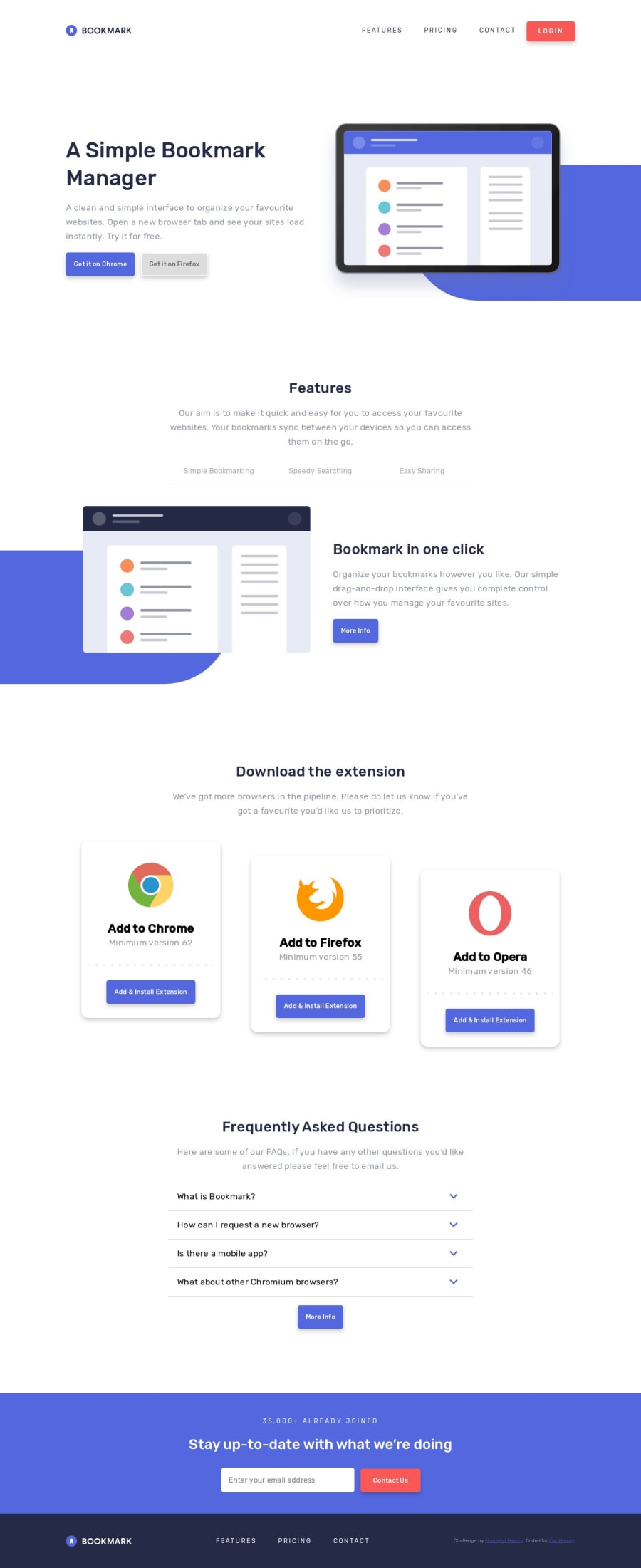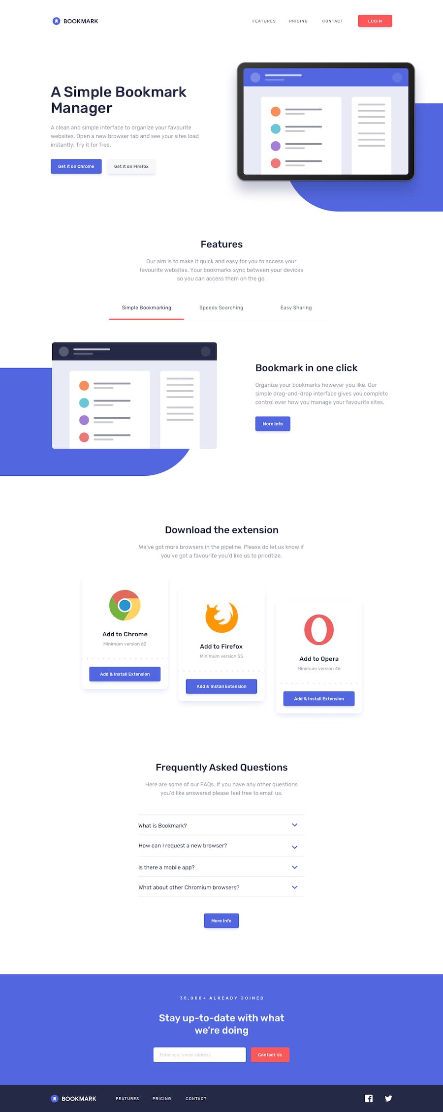
Bookmark landing pager (Vanilla JS, HTML, and CSS)
Design comparison
Solution retrospective
This was tough layout for me, especially with getting the size and positioning right for the SVGs (particularly under the 'Features' section). Any insights or advice on working with and properly sizing SVGs is much appreciated!
I also used <details> and <summary> for the disclosure portion of the page under 'Frequently Asked Questions.' I'm curious how others approached this, and if using <details> and <summary> presents any usability/accessibility issues that I'm not seeing.
Thanks in advance for having a look!
Community feedback
- @simeon4realPosted almost 5 years ago
Hello Zac, I must say, I am ver impressed with your solution. This is stuff way above my skill level and I liked it. I'm yet to attempt this challenge myself. Aside from the accessibility issues pointed out in the accessibility report, I have just one suggestion to add.
Rather than resizing each heading and text font sizes individually, I think you should add
html {
	font-size: 62.5%
}
This way, 1rem will always be === 10px. Calculation: 100% ÷ 16px(browser default) * 10px === 62.5%. Now, your font-size is 10px aka 1rem in your root.
What you could do on smaller screen sizes is to change the size of your root to say, 8px.
html {
	font-size: 50%;
}
Now, 1rem === 8px. Calculation: 100% ÷ 16px(browser default) * 8 === 50%.
If you found my recommendation useful, you can upvote my feedback. I would appreciate that.
2@zac-heiseyPosted almost 5 years ago@simeon4real Thanks for the feedback! I'm still considering using some type of flexible type solution like you mentioned, but haven't got around to implementing that just yet.
I was looking at doing something like Matt Smith outlines here, where I would set a
font-sizerule on the:rootelement::root { font-size: calc(1vw + 1vh + .5vmin); }0 - @mattstuddertPosted almost 5 years ago
Awesome work on this challenge, Zac! It's funny you should ask about the
detailsas I just read an article recommending not to use it for accordions. You can read it here. The gist of it is that thesummaryelement is technically a button. Buttons can't have headings inside, so it "eats" the semantics if you've got headings inside. The A11y Project has some good patterns you can use.It's a shame there seem to be so many issues around
detailsandsummary. In theory, it's such a nice way to do accordions!What issues were you having with sizing SVGs? They look fine to me.
Keep up the great work! 👍
0
Please log in to post a comment
Log in with GitHubJoin our Discord community
Join thousands of Frontend Mentor community members taking the challenges, sharing resources, helping each other, and chatting about all things front-end!
Join our Discord
