Submitted 8 months ago
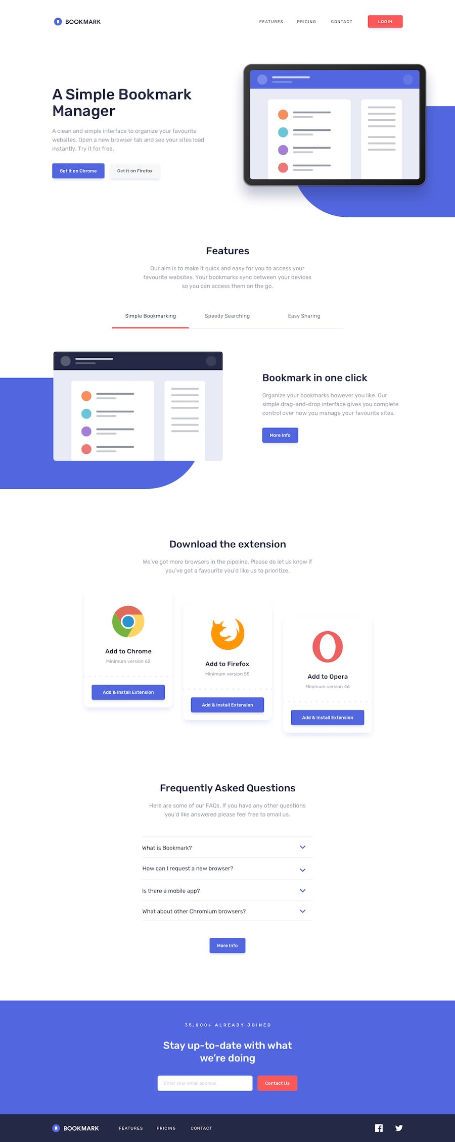
Bookmark landing page with tailwind
#tailwind-css#accessibility
@G-Gakii
Design comparison
SolutionDesign
Solution retrospective
What specific areas of your project would you like help with?
Any feedback to improve i will appreciate
Community feedback
- @kaoutar-ouadihPosted 7 months ago
Good work!
Just some adjustements:
- for the button in the navbar you need to add a transparent border to avoid the weird behaviour that occurs when hovering it, and it's better to work with it as a button not an li.
class="border-transparent border-2 hover:border-softRed " - for the quetions in the FAQ maybe you need to add a simple transition to make diplaying answers smoother.
class="transition duration-300"and add a hover state for the button more info. - for the footer you need to adjust the layout of the elements maybe add a
class="grow"for the ul tha contains features pricing .... and change the fill in the path of the svg<path fill="#FFF"></path>to make the text white.
But aside from that Great job.
0 - for the button in the navbar you need to add a transparent border to avoid the weird behaviour that occurs when hovering it, and it's better to work with it as a button not an li.
Please log in to post a comment
Log in with GitHubJoin our Discord community
Join thousands of Frontend Mentor community members taking the challenges, sharing resources, helping each other, and chatting about all things front-end!
Join our Discord
