Design comparison
SolutionDesign
Solution retrospective
The difficult parts of this project were:
- Dynamically sized accordion items
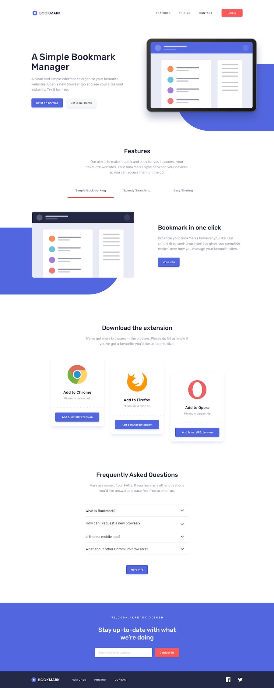
- Figuring a way to position the blue background in a fixed position while stretching it until the corner of the page
- Positioning the images of the features section to closely match the design, since they were all of different sizes. It became much easier after I edited the svg files to make them have the same height
Any feedback is welcome!
Community feedback
Please log in to post a comment
Log in with GitHubJoin our Discord community
Join thousands of Frontend Mentor community members taking the challenges, sharing resources, helping each other, and chatting about all things front-end!
Join our Discord
