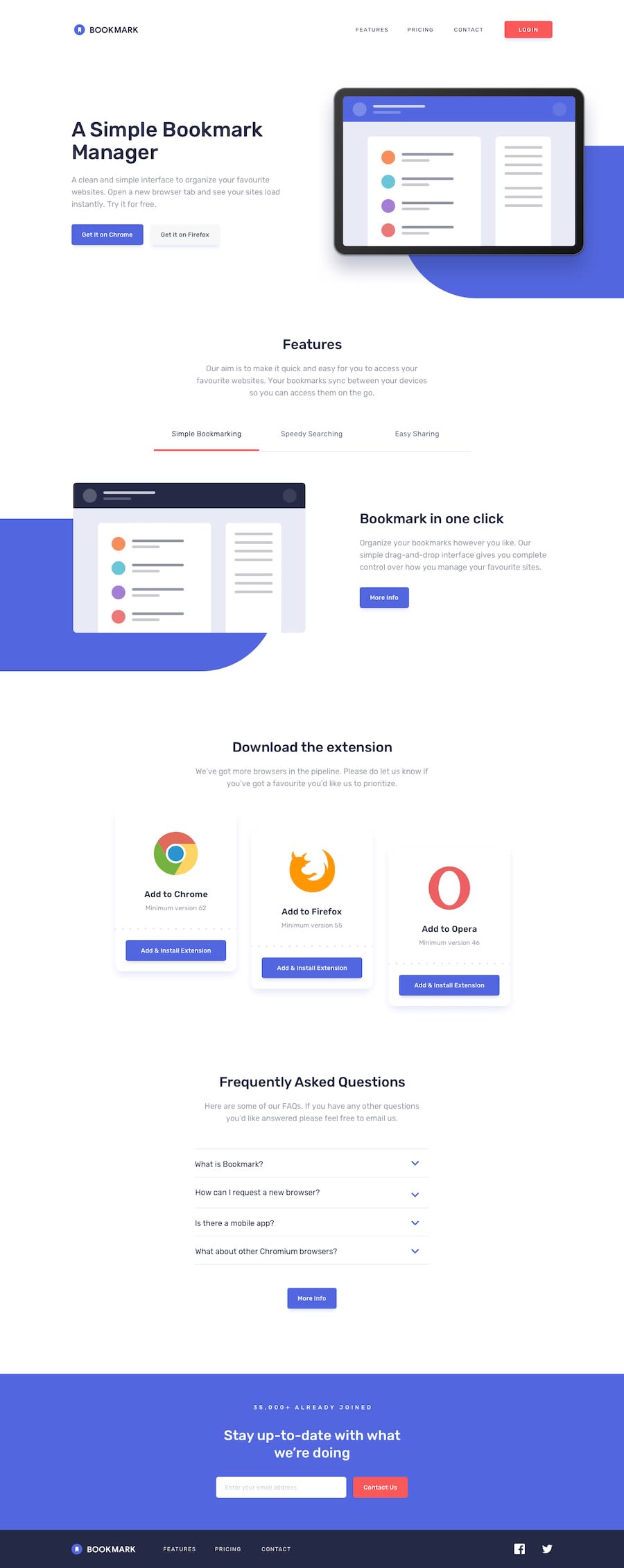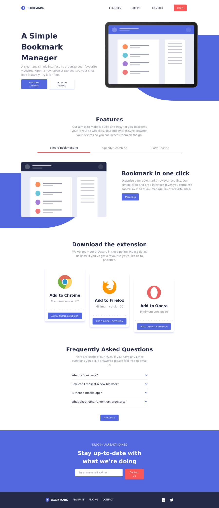
Bookmark landing page with ReactJS, CSS Grid and Stitches
Design comparison
Solution retrospective
Any feedback to help me improve this project would be appreciated.
Community feedback
- @Senkuu-MidoriyaPosted about 2 years ago
Hey @nazifbara, amazing website you have got here, I am still working on my rendition of this webpage but what you got here is amazing, and is almost exactly like a design, this shows a lot of skill and hard work that you must have put in to make the webpage, and it has really payed off. I especially love how you have done the box shadows, it really brings out the white just like the design. If I may, I have a few pieces of advice for you: 1). you might want to use different fonts weights as given in the style guide to make the links look better. 2). if you add a transition to the elements of you webpage that have a effect like hover on them it will be a much nicer looking transition to the hover state, etc. 3). if you add a margin or padding to the text or image where it says "A Simple Bookmark Manager" the image will overflow of the screen which is the affect that it has on the design, and if you apply an overflow hidden on the entire body the x-axis scroll bar will go away this can also apply to the other images on the webpage which also require the same type of styling as per the design. 4). on the button for the tabs such as simple bookmarking, if you apply an outline of none, when it is clicked on there will not be an outline which will make the user experience better. 5). on the accordion if you use a ui library like material ui or use some more JS you can make it so that only one accordion can be open at a time so that the user won't have to scroll or open an close the accordion bar manually. 6). for the contact us component if you add a width of 100% the entire width of the webpage should be taken up by that element like in the design.
I loved how you were able to make the accordion and dropdown almost exactly like the design as I am struggling with that, I would appreciate it a lot if you would mind taking the time to explain how you made those two elements, as you seemed to be an experienced developer, and my begin a newbie, the advice that you give would be invaluable to me, and my web dev journey.
Thank you for taking the time to show us your wonderful webpage and helping us learn from it, any advice from an experience dev like you would be appreciated.
Amazing website, aDev
Marked as helpful1@nazifbaraPosted about 2 years agoHi @Senkuu-Midoriya. Thanks a lot for your feedback. I can draw from it for the updates to come.
To make the accordion, I created an array that stored all of the Q&As.
const QUESTIONS = [ { question: 'What is Bookmark?', answer: 'Lorem ipsum dolor sit amet, consectetur ....', },
Then I created a state that mapped each element index to a boolean (
false
initially).const INITIAL_STATE = QUESTIONS.reduce( (prev, q, i) => ({ ...prev, [i]: false }), {} ); const [openedIdx, setOpenedIdx] = useState(INITIAL_STATE);
It allowed me to show an answer only when its corresponding index is mapped to true.
const isOpen = (i) => openedIdx[i]; {isOpen(i) && <Typography>{q.answer}</Typography>}
Next, I attached a click event handler (
toggle
) to each accordion button:const toggle = (i) => (e) => { setOpenedIdx((s) => ({ ...s, [i]: !s[i] })); }; {QUESTIONS.map((q, i) => ( <Box as="article" key={`question-${i}`}> <Box as="button" onClick={toggle(i)}
The styling changes based on the accordion state, as you can see here:
css={{ ... pb: isOpen(i) ? '10px' : '20px', // ... borderBottom: isOpen(i) ? 0 : '1px solid $grayishLightContrast', svg: { ... transform: isOpen(i) ? 'rotate(180deg)' : 'none', path: { stroke: isOpen(i) ? '$primary' : '$secondary', }, }, }}
I hope you'll find this helpful. Don't hesitate to ask me if you need more clarifications.
1@Senkuu-MidoriyaPosted about 2 years ago@nazifbara, Thanks you for taking the time out of your day to answer my question, the way you did your accordion is very novel, and actually a better way to do it that I have been, very smart! Thank you for sharing these pieces of knowledge with me.
0
Please log in to post a comment
Log in with GitHubJoin our Discord community
Join thousands of Frontend Mentor community members taking the challenges, sharing resources, helping each other, and chatting about all things front-end!
Join our Discord