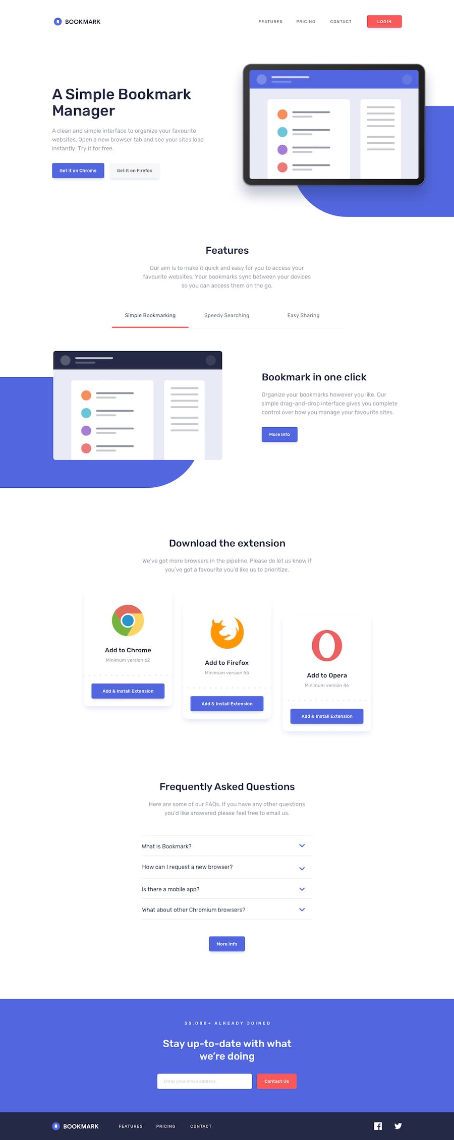
Design comparison
Solution retrospective
Skipped the mobile version because wanted to focus on the functionality of the tabbed features, accordion and email validation rather than media query styling.
Tried to avoid using pre-packaged code and instead used React state to handle the functionality.
Community feedback
- @MarkoNikolajevicPosted over 4 years ago
Hi George, you did a good job, tabs work perfectly! I dont't know if it is just for me, but accordions doesn't open/close everytime I click on them.
You can even break your
FeatureItemscomponent in smaller components, for example you can create a component that renders a tab and change the props for each tab1@georgehobbsPosted over 4 years ago@MarkoNikolajevic Thanks for your feedback Marko. Yes there is an issue with the accordion: I applied the onClick function to the parent div but when the child text or chevron elements are clicked the function doesn't trigger - do you know how I can trigger the parent's function so that the whole area is listening?
0@MarkoNikolajevicPosted over 4 years ago@georgehobbs I tried to move the click event on the parent element, it triggers correctly if you click on the div but it's not if you click on the
h4<div className='faq-card' onClick={faqClicked}> <div className='row faq-question' id='faq1'> // rest of the code </div> </div>-
I noticed that in some places, like in the
Navcomponents you useclassinstead ofclassName -
In
Download,FeatureItemsandNavcomponents<img/>should have and alt property
0 -
- @rfilenkoPosted over 4 years ago
Hello George, like your submition, but found a few issues you can easily fix:
- add responsiveness (its really easy to start from mobile and then make changes, when layout falls a part);
- advice to use classes for styling, not ids;
- don't use position: absolute to place items, it's harder to maintain and there will b issues with different width;
- for tabs probably better to use buttons with role="tab";
- disable pointer-events for arrow svg in accordion;
- use links in footer;
- smaller font for attribution :)
Roman
0@georgehobbsPosted over 4 years ago@rfilenko Thanks for your feedback. So you would recommend I first build the mobile version? Is it easier to build 'up' than 'down'? Any other advice for responsiveness? In the past I've used tonnes of media queries which don't feel particularly efficient!
0@rfilenkoPosted over 4 years ago@georgehobbs yes, definately, starting the mobile version first, browser helps with this. I've been trying to stick with this approach on all recent projects, it works really well. Because with desktop you are constantly overwriting a lot of stuff like layout, positioning elements, spacing, etc.
0@georgehobbsPosted over 4 years ago@rfilenko Great - will try that on my next project. Thanks!
0
Please log in to post a comment
Log in with GitHubJoin our Discord community
Join thousands of Frontend Mentor community members taking the challenges, sharing resources, helping each other, and chatting about all things front-end!
Join our Discord
