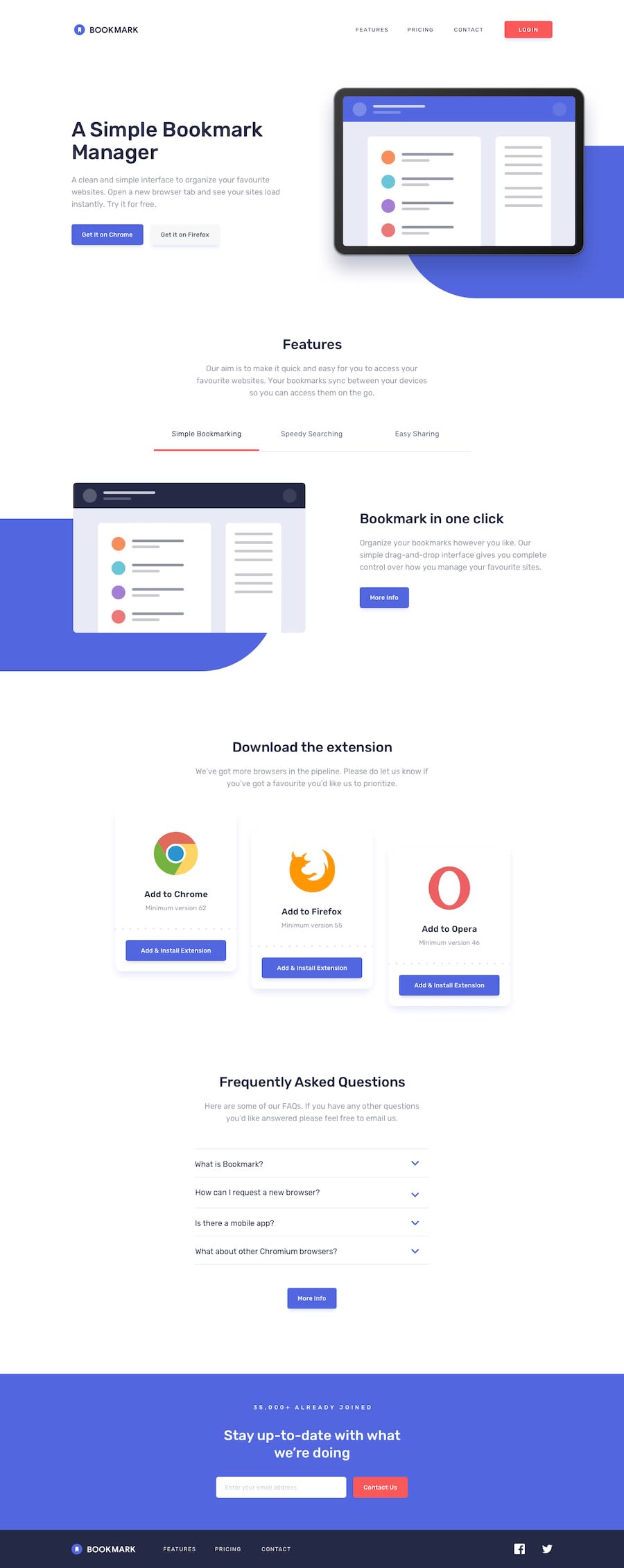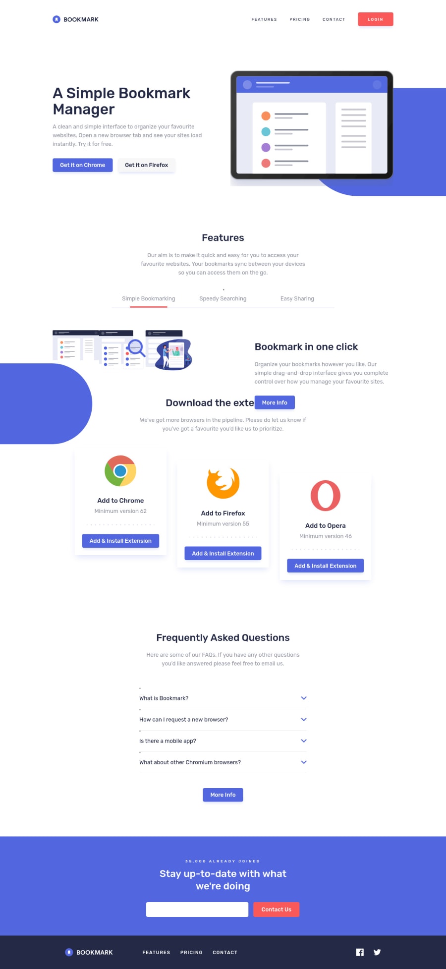
Bookmark Landing Page w/ CSS Animations 🎨 (but messy pseudoelements?)
Design comparison
Solution retrospective
After a nice break over Christmas, thought I'd ease myself back in with a single-page app.
Quite pleased with this one, there are a few things I think turned out quite well (none of the animations on the FAQ/feature images/form use javascript!), a few things I think turned out less well (the pseudoelements don't seem right). Seems a bit messed up on the preview but can't replicate in-browser so assume its a rendering thing
Was good to get a bit of practice using CSS Keyframes, and I think I'm going to start thinking about workflow going forward and taking a more modular approach (form validation was essentially stripped off an earlier project I did). Instead of writing my 100th hamburger menu in a few days, I now have a nice Vue component I can plug in and basically just adjust the list items and CSS accordingly.
But yes, any tips on how to get that kind of pseudo-element behind the hero image and the features image scaling properly at different screen sizes v much appreciated!
Community feedback
- @grace-snowPosted almost 3 years ago
Hello
A few quick wins available on this
- logo is the most valuable content on the page, it can't have an empty alt!
- remember to always add the type attribute on buttons. You'll avoid really annoying bugs
- menu toggles require the aria-expanded attribute. It's often a good idea to use aria-controls as well
- aria label on the social links needs to be on the link not image. Consider switching to Sr only text in there instead though - aria label is not reliably translated by browsers, whereas text in the dom is (for other language speakers)
Good job on this, it looks really nice
2@fraserwatPosted almost 3 years ago@grace-snow Thanks, this is super helpful!! Have made those changes.
On the aria-expanded attribute, am I right in thinking in this example I'd want to just have aria-expanded="false" on the hamburger menu, then ="true" on the close as it takes up the whole screen, so obscures the original menu. However, on an example where this wouldn't be the case, I'd probably want to use Javascript to update the attribute on the menu button?
As you mention screen reader only text, I have some of this on the form completion (end of form, id #success-message). Is this the correct implementation of it? Set to
role="alert"
, hidden with tiny font size and z-index, but display:none switched to inline when the form validation passes.0@grace-snowPosted over 2 years ago@fraserwat aria expanded would usually be the exact same state on both buttons. Usually you would only have one button to toggle a menu / disclosure pattern on/off tbh. Rather than having 2 buttons, one should be fine eg "toggle navigation". Aria- controls can help jaws screenreader users too - that points to the item being expanded so they know there is a direct relationship between button and the panel it controls
By Sr only text I didn't actually mean aria-live (like alert) announcements, that's a different thing. It could work fine but I was actually referring to an extremely widely used css snippet that accessibly hides content visually while leaving it available to screenreaders as they traverse the DOM. Look it up ☺
0
Please log in to post a comment
Log in with GitHubJoin our Discord community
Join thousands of Frontend Mentor community members taking the challenges, sharing resources, helping each other, and chatting about all things front-end!
Join our Discord