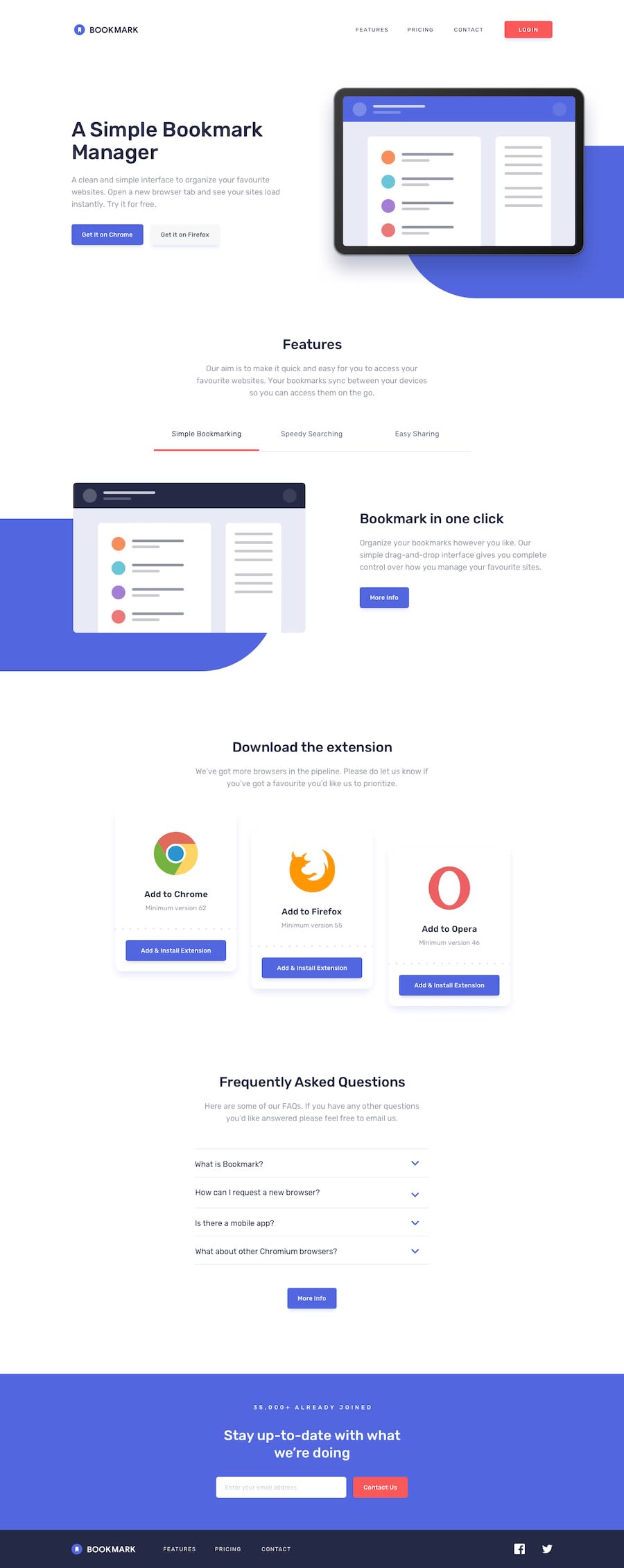
Design comparison
Solution retrospective
My first intermediate challenge. I really enjoyed making it 😄
Any feedback is kindly welcome! 🙂
Community feedback
- @GeorgeDarisPosted over 1 year ago
Hey there, George!
Your solution looks great, although I would suggest you change the breakpoints of your media queries, as I was served a mobile view on a laptop screen.
As for your code, I would highly suggest you try out the composition API as well and use it on a future project. I can't view your tailwind config file, but from your code I can tell that you used a lot of arbitrary values for your Tailwind classes, which could get simplified by extending the theme, which is similar to using custom properties when working with regular CSS.
Hope this helps!
0
Please log in to post a comment
Log in with GitHubJoin our Discord community
Join thousands of Frontend Mentor community members taking the challenges, sharing resources, helping each other, and chatting about all things front-end!
Join our Discord
