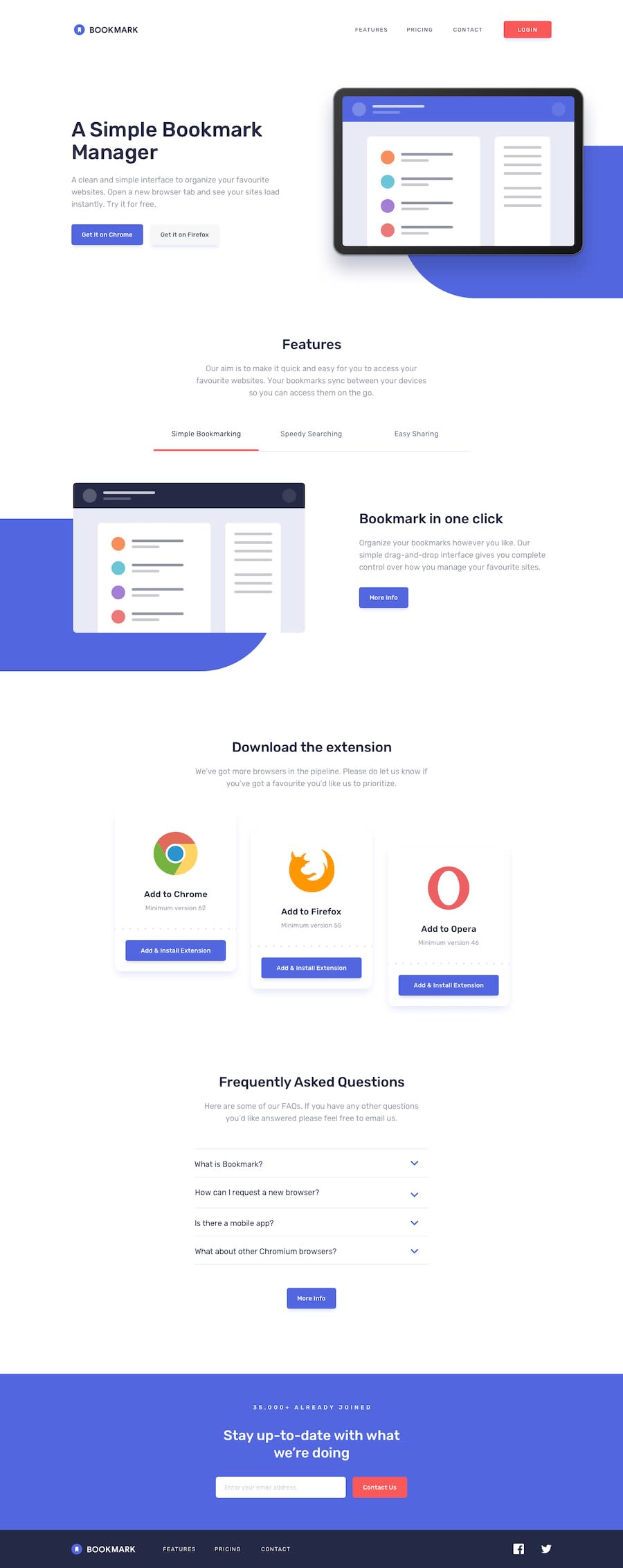
Bookmark landing page using Taiwind and NextJS
Design comparison
Solution retrospective
I am proud of to finish it as design provided. For the next time I would maybe work on to make it Perfect.
What challenges did you encounter, and how did you overcome them?Images and absolute div behind it beacuse in every size of screen if I try to fix for one screen it looked bigger or smaller for other screen. I ended up giving sizes for all screen but still I am not satisfied.
What specific areas of your project would you like help with?Same as above I would like help in absolute div and in FAQ section I put leading for answers but It was not applied It has somthing to with max-h, I tried removing all transition still no luck so I kept it as it is.
Community feedback
Please log in to post a comment
Log in with GitHubJoin our Discord community
Join thousands of Frontend Mentor community members taking the challenges, sharing resources, helping each other, and chatting about all things front-end!
Join our Discord
