Design comparison
SolutionDesign
Solution retrospective
Any feedback is welcome :)
Community feedback
- Account deleted
Hi,
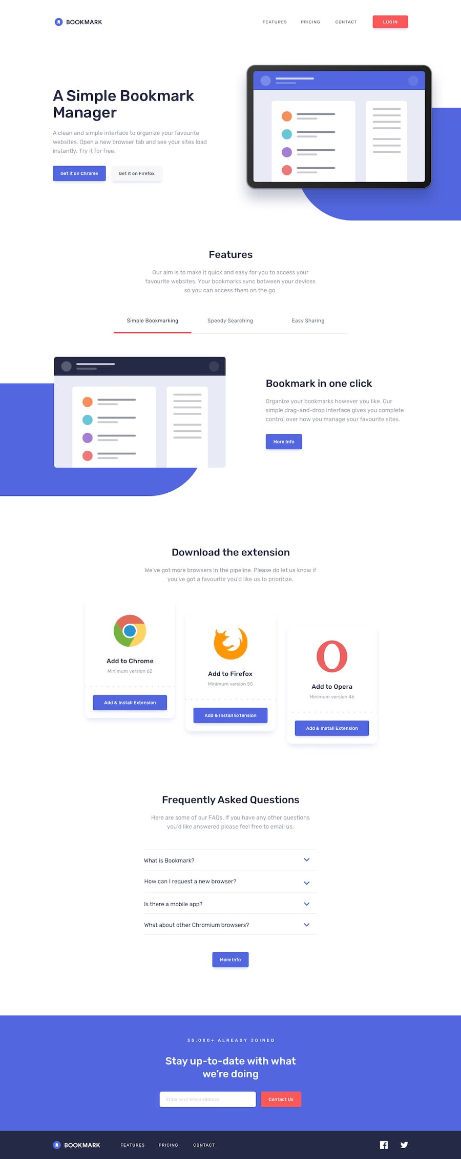
Your solution looks ok, but there's some things that need to be fixed;
- You should do something with the shape at the back of the first illustration image, it's protruding and giving the whole site a horizontal scroll, maybe try putting in a container and set the container to
overflow:hidden. - On mobile the first illustration image is not set to be responsive and it's way too big for the screen.
1@arkharman12Posted about 3 years ago@thulanigamtee I know there seems to be an overflow issue in the developer tools but I didn't notice anything on the actual screen widths?!
0 - You should do something with the shape at the back of the first illustration image, it's protruding and giving the whole site a horizontal scroll, maybe try putting in a container and set the container to
Please log in to post a comment
Log in with GitHubJoin our Discord community
Join thousands of Frontend Mentor community members taking the challenges, sharing resources, helping each other, and chatting about all things front-end!
Join our Discord
