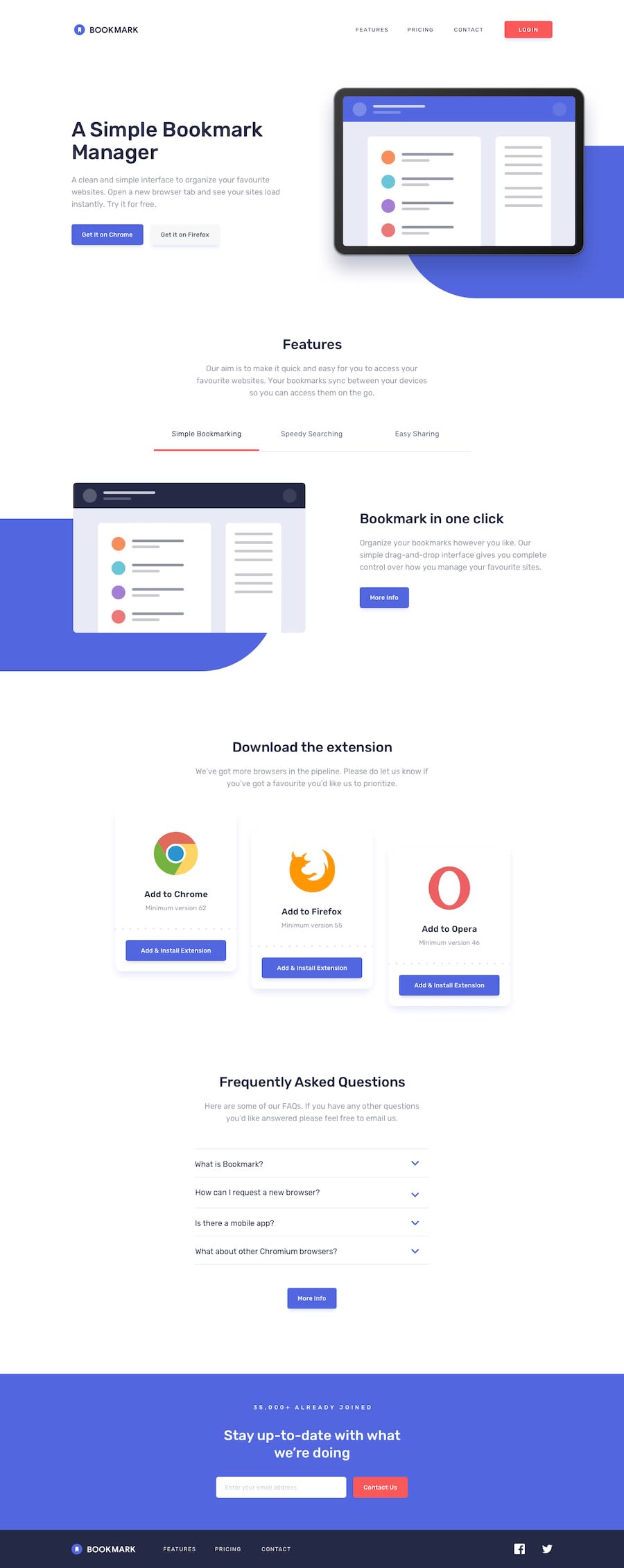
Bookmark landing page Using React & Material-UI
Design comparison
Community feedback
- @grace-snowPosted about 4 years ago
Hi, some really nice work here. Love that you've considered accessible forms and accordions, and great focus states!
There are some bits that really differ from the design though, like the shadow on the header bar and the width your content goes to. If you zoom out to emulate a larger display, you'll see the layout breaks. So I would create a wrapper class or something to limit the width of your content and position it centrally (horizontal center) on the screen no matter how big.
Other thing to watch with your layouts is how different components are having their widths limited in different ways. Some have a max-width 90%, others use padding or margin all at different widths. Again, if you had a wrapper class or component even to wrap chunks of content, the spacing at the sides of the screen (between content and screen edge on both sides) would be uniform no matter the screen size, and, crucially would be done using the same method every time.
I hope that makes sense, it's quite a hard concept to explain... all about systemising design and layouts, which becomes quite important when you start building components in frameworks like React. The basic idea is to be able to drop components in on different pages in different contexts and always have the same spacing and alignment, no matter where they are used.
Best of luck with it, keep on coding
1
Please log in to post a comment
Log in with GitHubJoin our Discord community
Join thousands of Frontend Mentor community members taking the challenges, sharing resources, helping each other, and chatting about all things front-end!
Join our Discord
