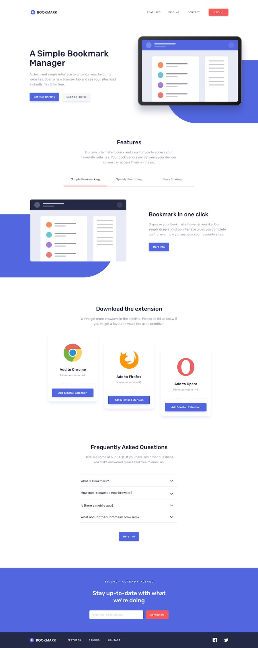
Design comparison
Solution retrospective
All feedback is appreciated 🤓🧐
Community feedback
- @ZukizukPosted 10 months ago
Hello there, Congratulations on completing this project
Your solution looks nice
I have few suggestions that I think might be of interest to you.
- HTML: Consider using semantic HTML tags like
<main></main>,<section></section>and others that you can find in this link. And in this case, replace the<div class>with<main>. the main tag should hold the main content of the page so consider correcting that.The semantic HTML tags help the search engines and other user devices to determine the importance and context of web pages. The pages made with semantic elements are much easier to read. It has greater accessibility. It offers a better user experience. Using div when there's a better alternative is not a good practice as div hold no semantic value.
I hope this feedback is helpful
Other than that great job
Marked as helpful1
Please log in to post a comment
Log in with GitHubJoin our Discord community
Join thousands of Frontend Mentor community members taking the challenges, sharing resources, helping each other, and chatting about all things front-end!
Join our Discord
