Submitted over 4 years agoA solution to the Bookmark landing page challenge
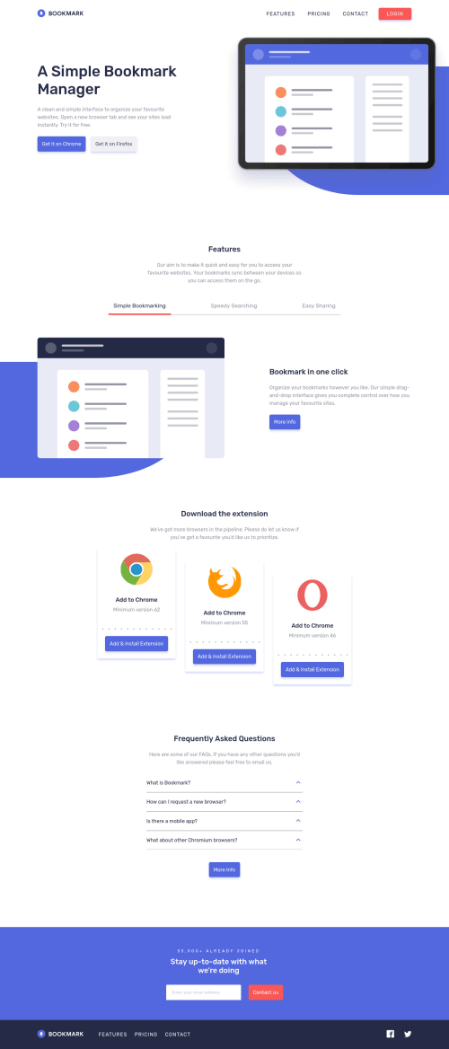
Bookmark Landing Page using JS Vanilla, SASS and BEM
@Yaiza16

Solution retrospective
So this challenge has been my first one using Webpack. Probably there are some mistakes with the related files but it works.. I’ve been struggling a lot with that and probably it is not the most efficient way to do it so please, let me know any advice.
I added some functionalities such as animations to the header when site is loaded and a sticky nav bar using Intersection Observer API.
Feel free to give any feedback. It will be appreciated 😊
Code
Loading...
Please log in to post a comment
Log in with GitHubCommunity feedback
No feedback yet. Be the first to give feedback on Yaiza's solution.
Join our Discord community
Join thousands of Frontend Mentor community members taking the challenges, sharing resources, helping each other, and chatting about all things front-end!
Join our Discord