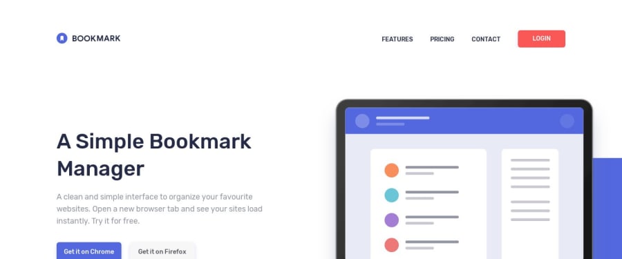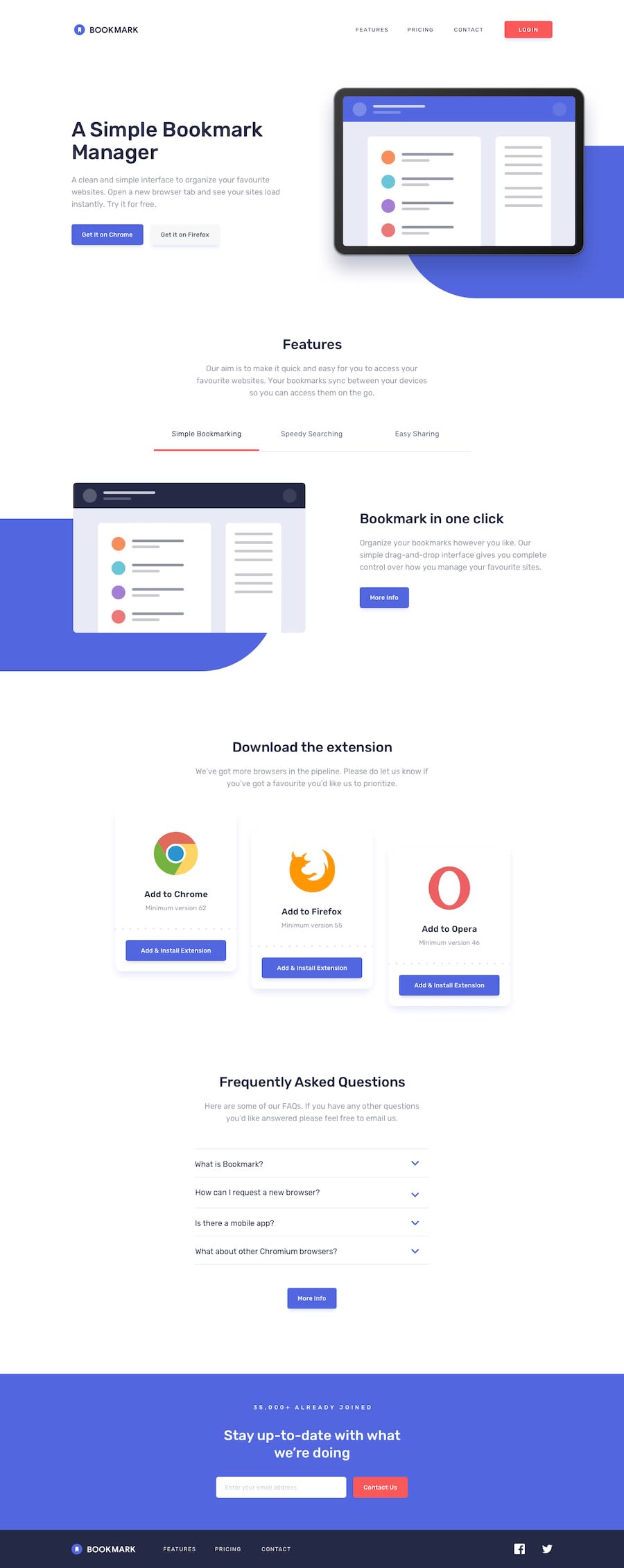
Bookmark landing page using grid and flex css
Design comparison
Solution retrospective
please review my code, i'm trying make my code more modular maybe this looks messy. if there are suggestions, I accept it gladly. thanks in advance :)
Community feedback
- @mattstuddertPosted over 4 years ago
Hey Muhammad, nice work on this challenge. Your code doesn't look messy at all. It looks like you've got a good code architecture and a system for doing things, which is great. The main piece of feedback I'd have is to avoid setting click listeners on non-interactive elements. For example, you've got click listeners on the
lielements for the tabs. Thelielement isn't interactive by default, so it can't be focused for selection by people who cannot use a mouse/trackpad to click. This makes it inaccessible, which isn't good. Instead, you could use abuttonoraelement and set a click listener on that. This means people using mouse/trackpad or keyboard and other assistive technologies can select the element to change the content.I hope this helps. Your solution looks really good. Keep it up!
1@fadzrinmaduPosted over 4 years ago@mattstuddert i will remember it well thank you very much for the comment, this is very helpful. I will try to learn more about it
0@mattstuddertPosted over 4 years ago@fadzrinmadu you’re welcome! Smashing Magazine articles often talk a lot about accessibility, so I’d recommend looking out for them.
1
Please log in to post a comment
Log in with GitHubJoin our Discord community
Join thousands of Frontend Mentor community members taking the challenges, sharing resources, helping each other, and chatting about all things front-end!
Join our Discord
