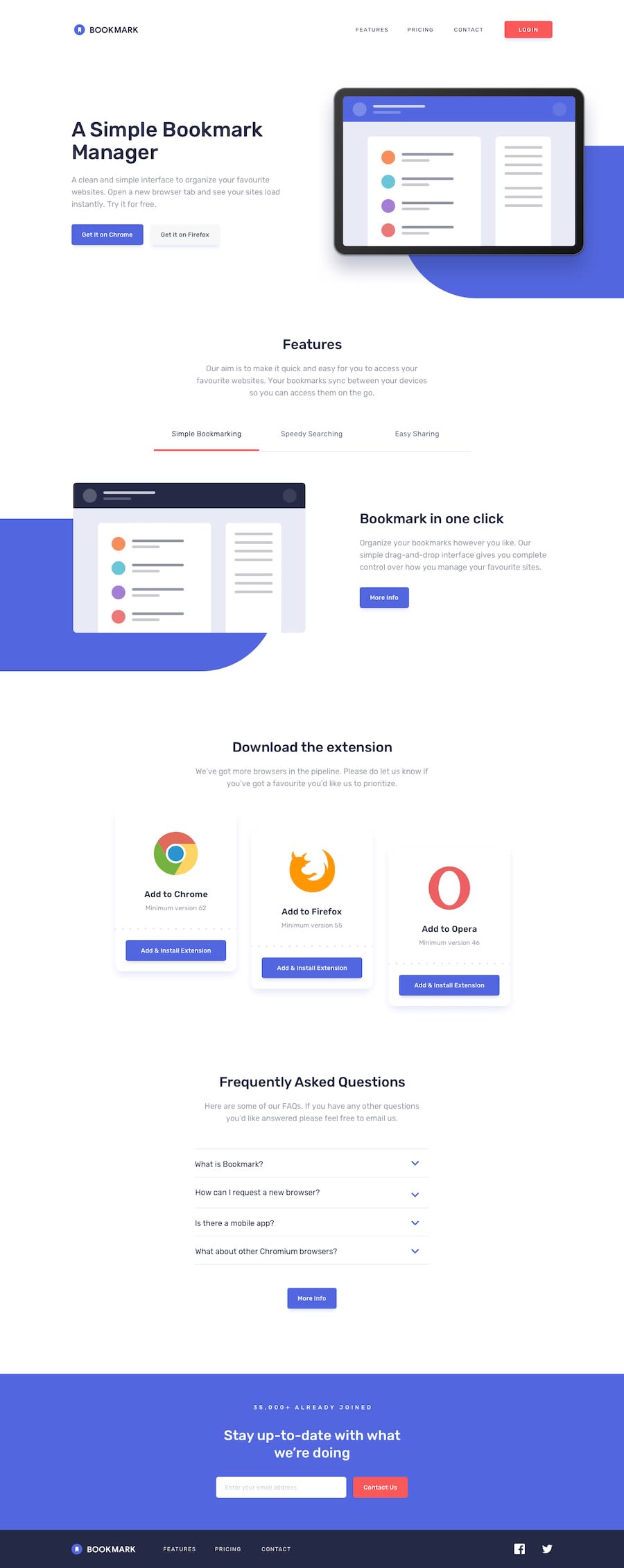
Design comparison
Solution retrospective
Hi,
Any feedback would be appreciated :)
Thanks
Community feedback
- Account deleted
Hi, @thibault-barrat
Desktop view looks good and I like the animations on the features section when you switch between tabs, but there's things I noticed that need fixing;
-
Something is giving your site a horizontal scroll, and I don't know what it is but it should be looked at.
-
I think you should do a tablet version, or something because the transition from desktop to mobile isn't good.
-
On mobile you have inactive tab content visible, chilling next to the active tab content, whereas it shouldn't unless it is activated.
0@thibault-barratPosted about 3 years ago@thulanigamtee Thank you for the feedback. I think that you are using Safari, right ? I didn't see the horizontal scroll issue on Chrome or Firefox and it seems that Safari need to have 'overflow-x:hidden' on html and not on body. Now, it should be fixed.
0 -
Please log in to post a comment
Log in with GitHubJoin our Discord community
Join thousands of Frontend Mentor community members taking the challenges, sharing resources, helping each other, and chatting about all things front-end!
Join our Discord
