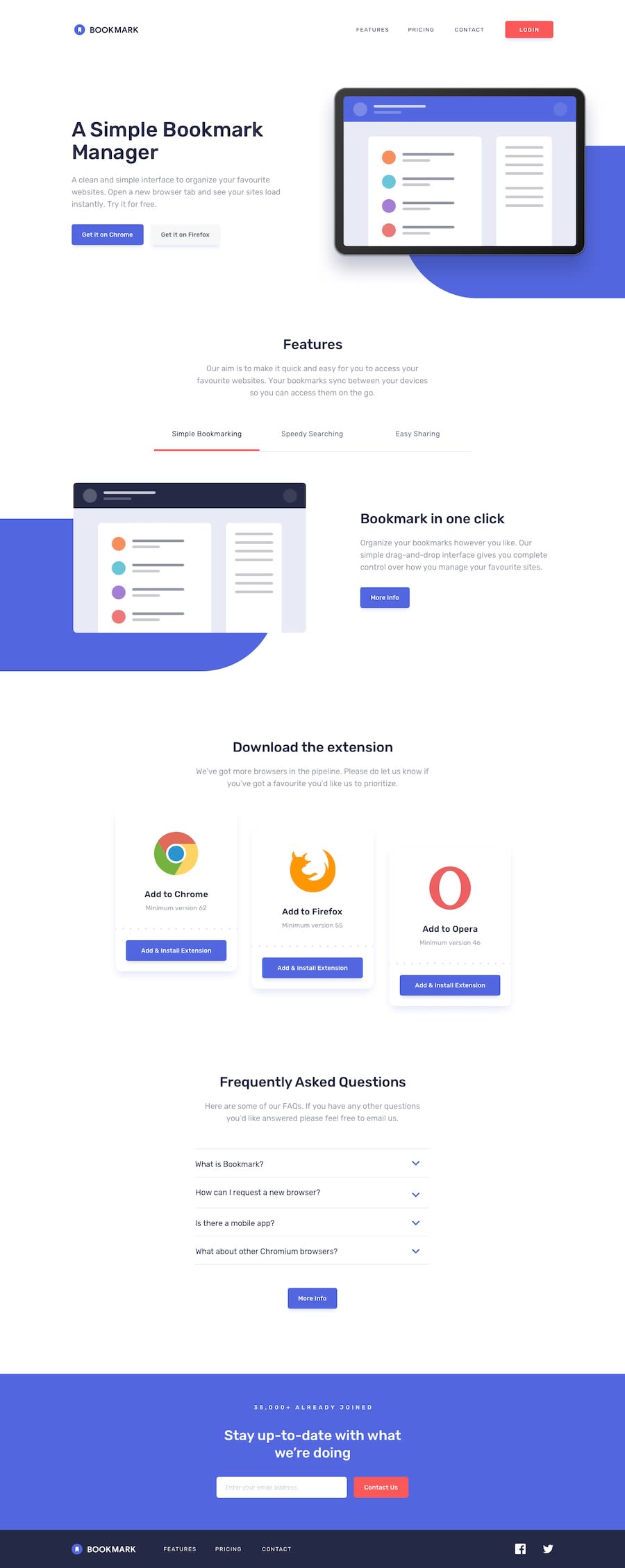
Design comparison
Solution retrospective
That was a lot of work. I definitely feel like there is a better and easier way to create this site. Any help in terms of shifting my coding style? Additionally, whats the rule of thumb for margining and padding with parent/child containers?
Thanks.
Community feedback
- @mattstuddertPosted over 4 years ago
Great work on this challenge, Mar! It's a large page, so it will definitely need more code than some of the other challenges.
One thing you could try on future projects is using
min-widthmedia queries instead ofmax-width. It's quite a common workflow with front-end developers to use them and work mobile-first. It can often lead to less CSS code and has the benefit of loading in fewer styles for mobile users, which can be a nice performance gain.I would recommend reviewing your breakpoints and maybe adding another one in. At a large mobile - small/medium tablet the content is a bit off. Making sites look good at as wide a range of screen sizes as possible is a key role of a front-end developer. So it's well worth putting in the time to practice it and refine those skills.
Keep up the great work! 👍
1
Please log in to post a comment
Log in with GitHubJoin our Discord community
Join thousands of Frontend Mentor community members taking the challenges, sharing resources, helping each other, and chatting about all things front-end!
Join our Discord
