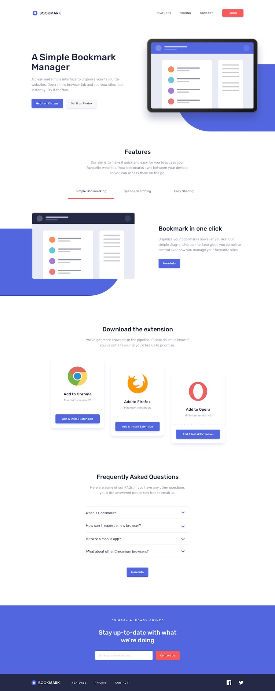
Bookmark Landing page- React+Vite | Tailwindcss- with the use of HOCs
Design comparison
Solution retrospective
🚀 Exciting News: Completed Another Frontend Mentor Project! 🚀
Hey Frontend Mentor community! 👋 I'm thrilled to share my latest achievement - successfully wrapping up the Bookmark Landing page challenge. 🎉✨
🛠 Tech Stack:
ReactJS: For building a dynamic and interactive user interface. Vite: The fast and efficient build tool that keeps development smooth. Tailwind CSS: Crafting a beautiful, responsive design effortlessly. 🔄 Highlights:
Higher Order Components (HOCs): Delving deep into HOCs for enhanced code reusability and maintainability. Tailwind Mastery: Gained a more in-depth understanding of Tailwind CSS, unlocking its full potential for streamlined styling. Reusable Components: Created a library of reusable components, ensuring a consistent and efficient development process.
🎥 Behind the Scenes: Catch a detailed walkthrough in the YouTube demo https://www.youtube.com/watch?v=KvvKdg40awc. I'll share insights into my approach, design decisions, and the magic of using HOCs and Tailwind CSS for a more polished project. Subscribe to my channel to stay updated!
💡 Lessons Learned: This project provided an opportunity to deepen my knowledge of HOCs and Tailwind CSS, unlocking their true potential in creating modular, maintainable, and beautifully styled components.
🙏 Thank You: A big shoutout to the Frontend Mentor community for the incredible support and the continuous opportunity to grow and improve. Let's keep pushing the boundaries of web development together!
Stay tuned for the YouTube walkthrough, and let's keep coding! 💻🚀
#FrontendMentor #ReactJS #ViteJS #TailwindCSS #WebDevelopment #HOC #ReusableComponents #CodingJourney #OpenSource #GitHub #CodeNewbie #DeveloperLife #TechCommunity #WebDevMagic
Community feedback
- @Andigashi1Posted over 1 year ago
Hey, i really like your project. I only noticed 2 small errors while i visited the site. There is a little arrow on top ">", and when you open the menu from the mobile view there is 2 logos, one in the background and on with the menu and it doesnt look good as the look stacked on top of eachother. However i loved everything else. Happy coding!
Marked as helpful1@kevorklepedjian1Posted over 1 year ago@Andigashi1 Thank you a lot Andi, i will check it out and fix it
0
Please log in to post a comment
Log in with GitHubJoin our Discord community
Join thousands of Frontend Mentor community members taking the challenges, sharing resources, helping each other, and chatting about all things front-end!
Join our Discord
