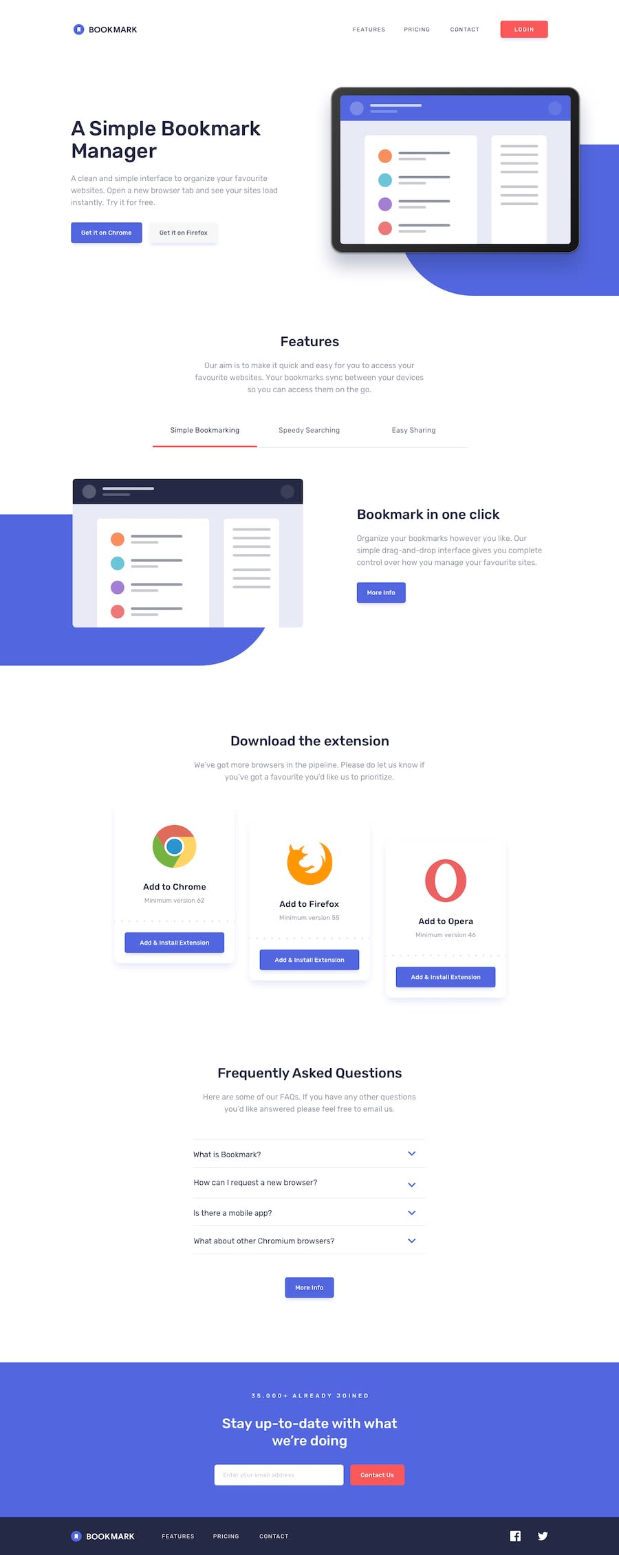
Design comparison
Solution retrospective
This was a fun challenge and was a bit tricky to put together.
I went with the mobile first approach for obvious reasons. The mobile menu took a bit of work to put together but turned out ok. The features section was a bit of a challenge, started by using border for the underline on the topics, but that didn't work out well, then moved on to text-decoration: underline which also didn't work, ended up using box-shadow, which worked perfectly.
There's a lot of things I did not implement, such as the transparent background on the mobile menu, the change of the color of the arrows on the accordion and some other minor details.
I enjoyed doing this challenge, and I feel like the way I write and organize my code is getting polished.
Any feedback or suggestion will be highly appreciated.
Community feedback
Please log in to post a comment
Log in with GitHubJoin our Discord community
Join thousands of Frontend Mentor community members taking the challenges, sharing resources, helping each other, and chatting about all things front-end!
Join our Discord
