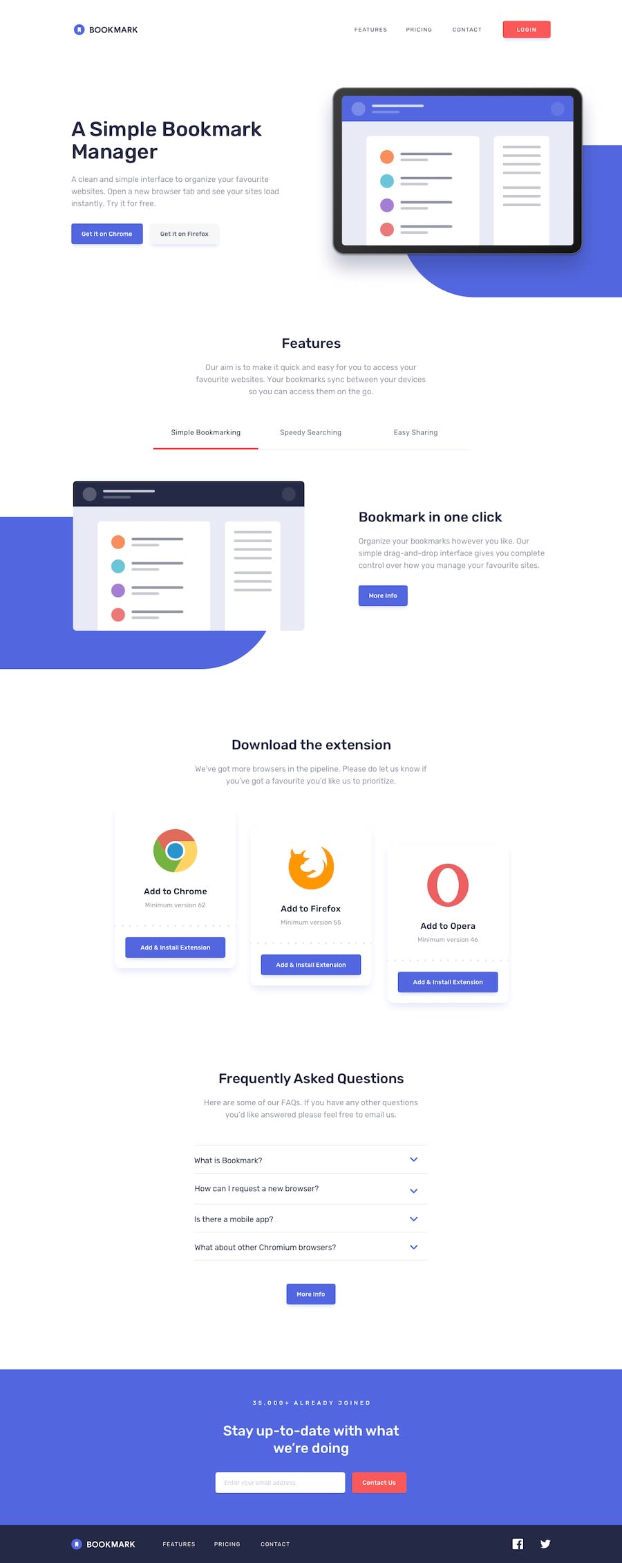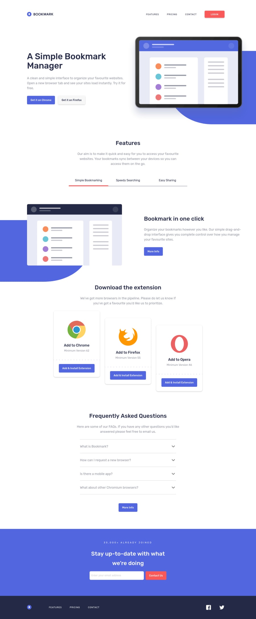
Design comparison
Solution retrospective
Desktop design only. I have a few questions on how to fix some issues:
-How do I get the proper dimensions for the image sizes on the Features component? You can see that the different images that populate the left-hand side will cause the overall site layout height to change, and content will jump.
-How do I make the green ::before on the Features image & Header image stay fixed-in-lace relative to the accompanying image, when the viewport width is made more narrow? And how do I make the ::before's dimensions stay constant on scaling while using responsive units like percentage?
-How do I adjust color of the text but not the icon in the SVG logo in the footer, which needs white text instead of black?
Thank you! I greatly appreciate any help. :)
Community feedback
- @PhoenixDev22Posted over 2 years ago
Hello zshawdev,
Great work! Congratulation on completing this frontend mentor. I have some suggestions regarding your solution if you don't mind:
HTML
- The logo's alternate text should not be empty. Use the website's name as an alternate text. You may set
alt=”Bookmark logo"
.It’s better to place it out the<nav>
as it does navigate the user.
look up a bit more about how and when to write alt text on images. Learn the differences with decorative/meaningless images vs important content For decorative images, you set an empty
alt
to it with anaria-hidden=”true”
to remove that element from the accessibility tree. This can improve the experience for assistive technology users by hiding purely decorative images.- It's not recommended to use only
<span>
alone to wrap meaningful content. For example Inclass="card"
,you may use<p>
instead.
The alternate text for the firefox and opera logo is the same as
alt="Google Chrome logo"
, it has to be changed to the corresponding img.You might already be aware of this, but you can use the native HTML
details
andsummary
elements to quite easily make interactive accordions that are fairly accessible.- Add
aria-label=”secondary “
oraria-label=”footer”
to the<nav>
in the footer. A brief description of the purpose of the navigation, omitting the term "navigation", as the screen reader will read both the role and the contents of the label. Thenav
element in the header could use anaria-label="primary"
oraria-label=”main”
attribute on it. The reason for this is that, You should add thearia-label
for a nav element if you are using the nav more than once on the page.you can read more in MDN
Never use
<div>
alone to wrap a meaningful content. Just keep in mind that you should usually use semantic HTML in place of the div tag unless none of them (the semantic tags) really match the content to group together.* By adding semantic tags to your document, you provide additional information about the document, which aids in communication.- For the reason stated before, instead of using a generic
div
in<div class="cta__contact-us">
, use<form>
Forms with proper inputs and labels are much easier for people to use. To pair the label and input, one way is an explicit label’s
for
attribute value must match its input’sid
value. Input fields without accompanying labels can lead to accessibility issues for those who rely on screen readers. If a screen reader comes across an input field without a label it will try to find some accompanying text to use as the label. (To hide the label visually but present for assistive technology, you may usesr-only
class ).- The social links wrapping the icons must have
aria-label
orsr-only
text indicate where the link will take the user. Then you setaria-hidden =”true”
to the svg to be ignored by assistive technology .
When you are creating texts alike CONTACT PRICING.. you don't type them in html as uppercased , just use lowercase and in the CSS use text-transform: uppercase. the reason for this is that , when an assistive tech reads the text content , instead of reading the text by word it will be read by letter.
For the tabbable content in
class="section-features"
look up how can the assistive technology user know that this element is part of a group of related elements?Overall , you did great work. Hopefully this feedback helps.
0@zshawdevPosted over 2 years ago@PhoenixDev22 Thank you so much for your advice, PhoenixDev22! This is insanely helpful, I'm sitting down with this again and am implementing your suggestions. Thanks again. :)
1@PhoenixDev22Posted over 2 years ago@zshawdev Hi @zshawdev, You're welcome and Glad it was helpful. Happy coding!
0 - The logo's alternate text should not be empty. Use the website's name as an alternate text. You may set
Please log in to post a comment
Log in with GitHubJoin our Discord community
Join thousands of Frontend Mentor community members taking the challenges, sharing resources, helping each other, and chatting about all things front-end!
Join our Discord