Submitted over 2 years ago
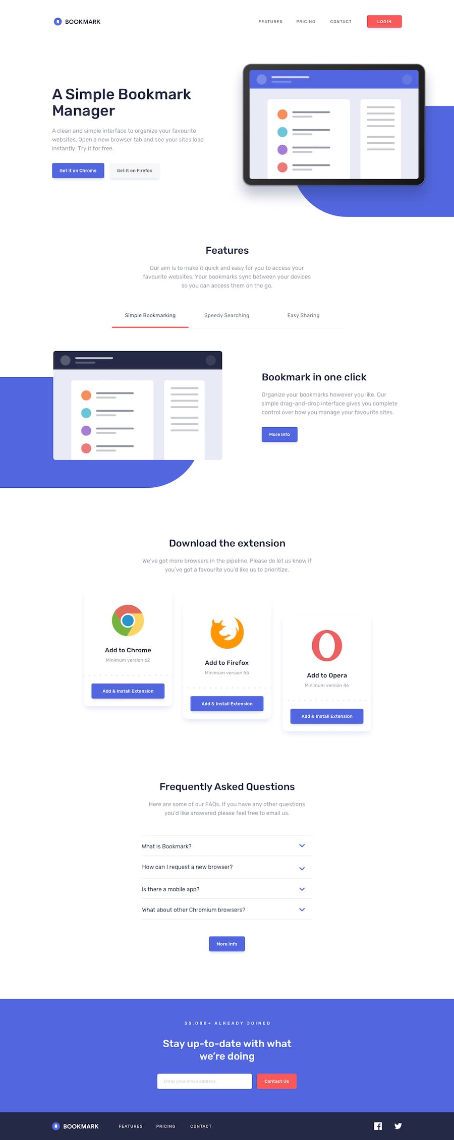
Bookmark landing page Mobile First
#accessibility#lighthouse
@PhoenixDev22
Design comparison
SolutionDesign
Solution retrospective
Greeting community, I have completed another frontend mentor challenge. I learned a lot while making it . I had a challenging time with the blue background behind the images. If you have any suggestions about best practices and any missing things or improving the functionality, please do leave a feedback. Thanks in advance.
Community feedback
Please log in to post a comment
Log in with GitHubJoin our Discord community
Join thousands of Frontend Mentor community members taking the challenges, sharing resources, helping each other, and chatting about all things front-end!
Join our Discord
