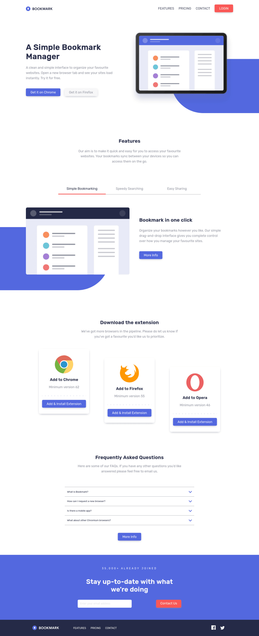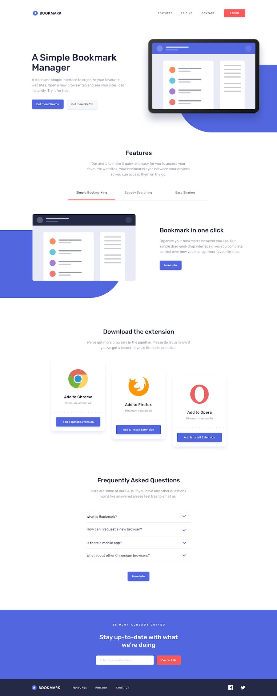
Design comparison
SolutionDesign
Please log in to post a comment
Log in with GitHubCommunity feedback
- @iadefidipe
Great work @RodCri! but you have a lot of improvements, I think you could make:
- You work isnt responsive on smaller screen
- the faq accordion can be improved on by ensuring once any section of the accordion is opened others are closed, no two sections can be opened at the same time. I think it will make for better user experience
- You should also work on the last FAQ section Cheers🐱👤
Join our Discord community
Join thousands of Frontend Mentor community members taking the challenges, sharing resources, helping each other, and chatting about all things front-end!
Join our Discord
