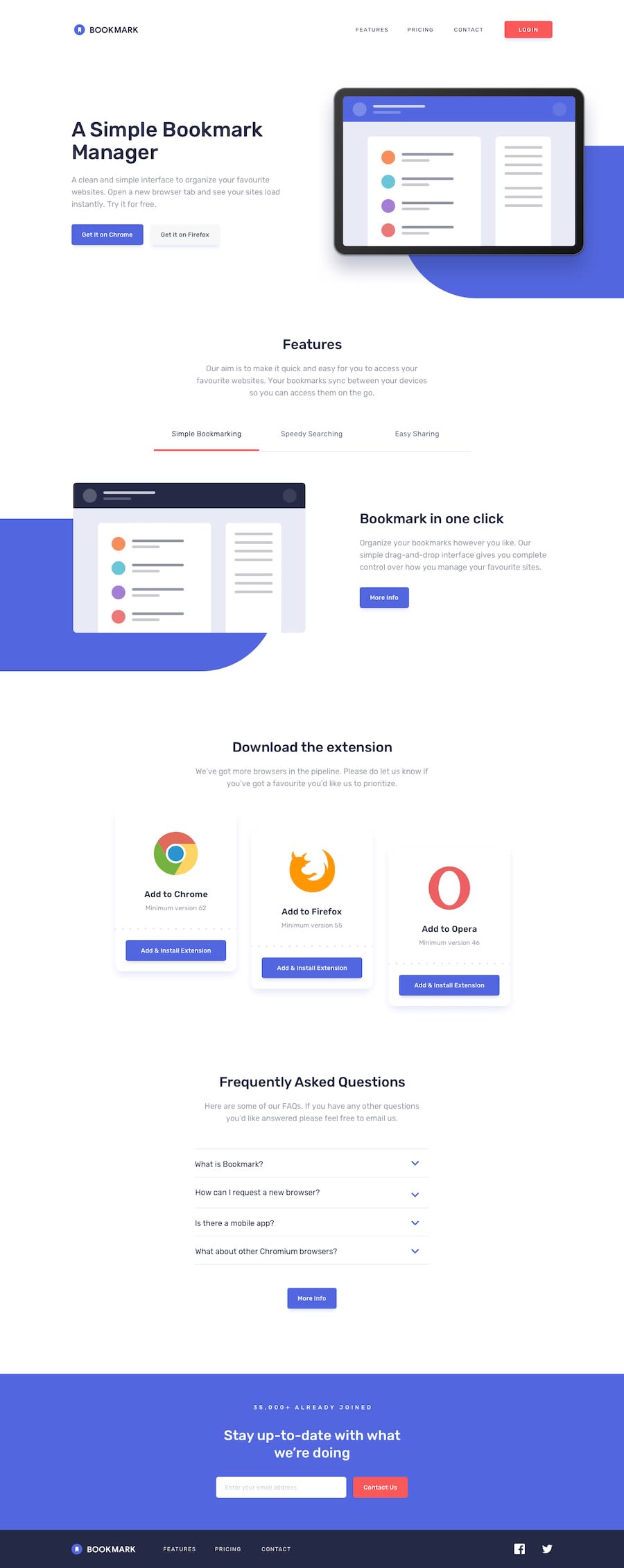
Design comparison
Solution retrospective
Feedback will be appreciated.
Community feedback
- @CodingDatumPosted over 3 years ago
Hey, well done! I love the design liberties you took, you clearly have a knack for this! There's really not a lot to critique here, but if I had to be picky, I would space out the navbar links a bit more. Also, the blue blobs in the background seem a tad off in terms of size and placement. Lastly, I think keeping the paragraph font colors a light grey as well adhering to the different button colors would be more on par with web design hierarchy, as well as what was being requested in the mock-up. Otherwise, awesome work!
0@shagor-coderPosted over 3 years ago@CodingDatum Thank you so much for the feedback. I will try my best to follow the instructions you have given..
0
Please log in to post a comment
Log in with GitHubJoin our Discord community
Join thousands of Frontend Mentor community members taking the challenges, sharing resources, helping each other, and chatting about all things front-end!
Join our Discord
