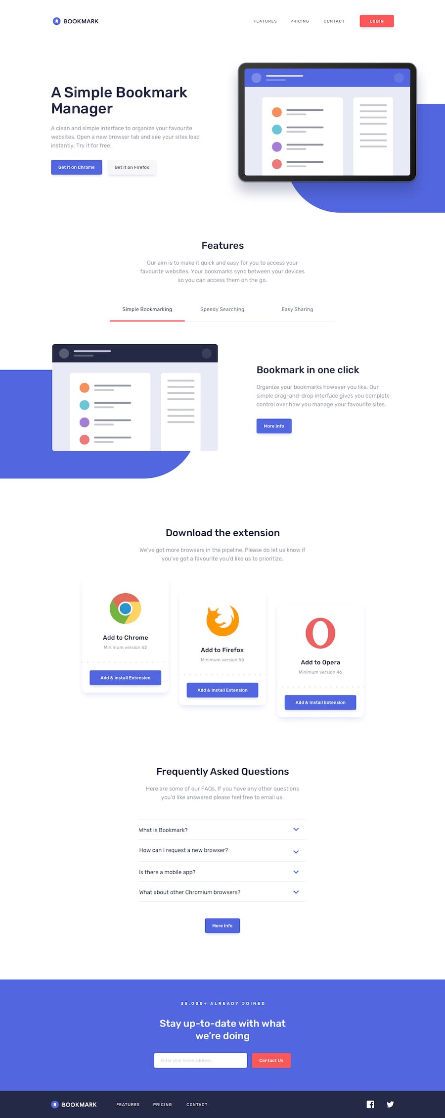
Design comparison
Solution retrospective
hello everyone ;) in this challenge I faced some excellent challenges regarding the management of the layout of the various sections and the management of the various images in SVG format such as that of the hero-section; But above all, both the Tab-sections and the FAQ section helped me manage a slightly more complex layout and match the appropriate JS code.
This time too I tried to use the CSS compilation technique called CUBE CSS to try to keep the code as clean as possible and avoid repetitions; However, I don't think I did it to the best of my ability...
I'm open to feedback of any kind, constructive criticism, comments, if you like, take a look at the code and tell me what you think, we could talk about it ;)
Community feedback
Please log in to post a comment
Log in with GitHubJoin our Discord community
Join thousands of Frontend Mentor community members taking the challenges, sharing resources, helping each other, and chatting about all things front-end!
Join our Discord
