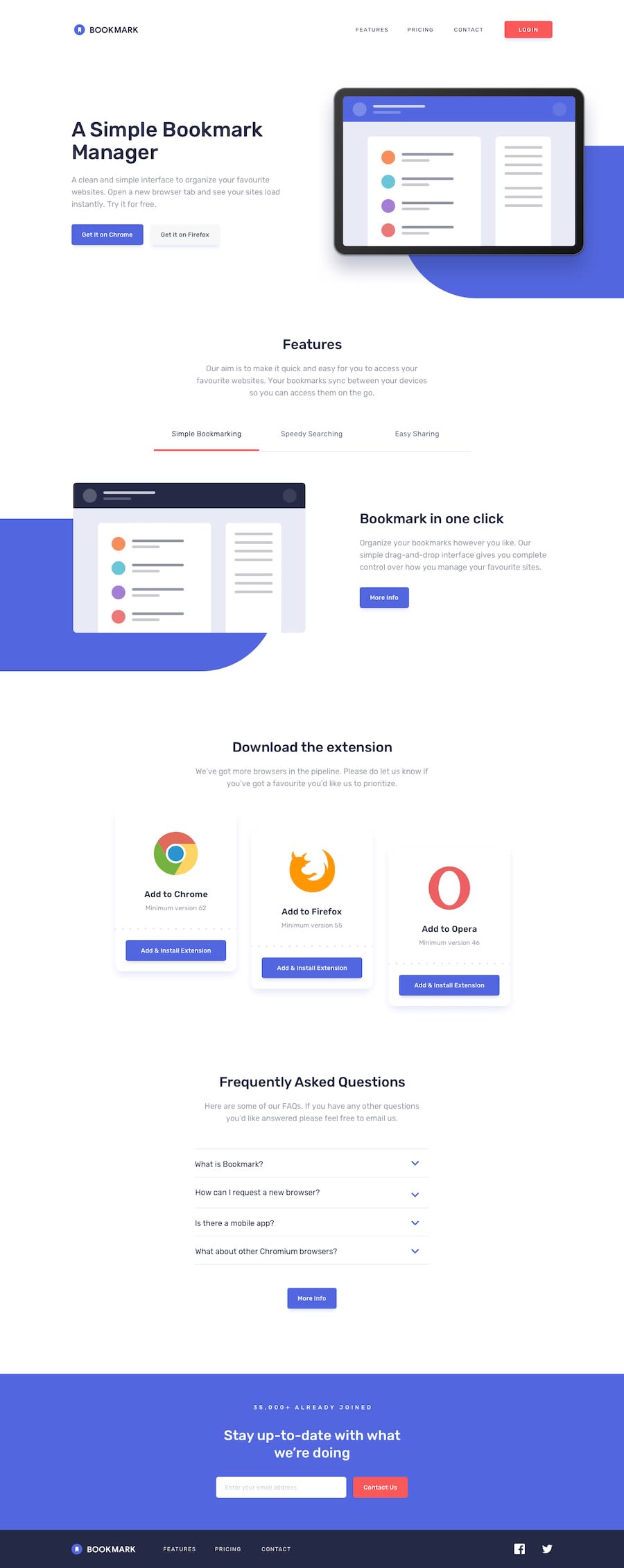
Design comparison
SolutionDesign
Solution retrospective
I'll appreciate any feedback. As the projects get bigger, I often lose the overview over the HTML/CSS structure. However, I still managed to finish the challenge. One problem I could not solve was changing the svg logo to full white, when the mobile navbar is expanded (i tried it with brightness and invert filter).
Community feedback
Please log in to post a comment
Log in with GitHubJoin our Discord community
Join thousands of Frontend Mentor community members taking the challenges, sharing resources, helping each other, and chatting about all things front-end!
Join our Discord
