Submitted almost 4 years agoA solution to the Bookmark landing page challenge
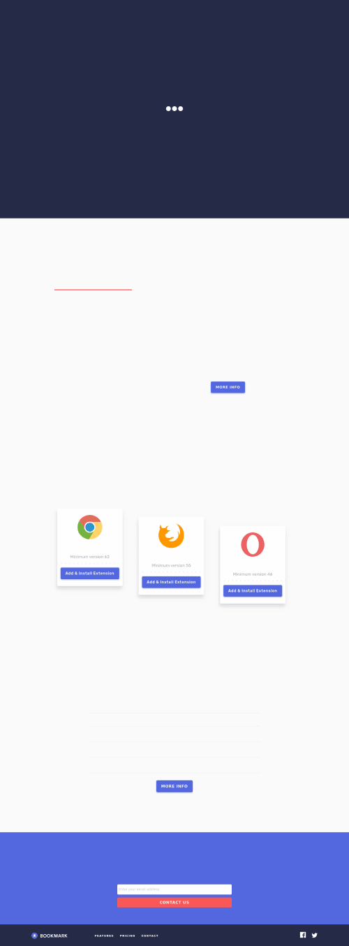
Bookmark Landing page (Fully Animated)
sass/scss, webpack, bem
@KhaledMostafa990

Solution retrospective
I just finish Bookmark Landing Page with animating the full content. Using Webpack for module bundling, in spite of the page not being much big, using Webpack is still much more efficient. Using grid system in 85% of the page to get more comfortable with. I tried to get the page pixel perfect as I can hope it be correct, any feedback or recommendations for better code structure || performance are very appreciated. Thanks.
Code
Loading...
Please log in to post a comment
Log in with GitHubCommunity feedback
No feedback yet. Be the first to give feedback on Khaled Farghly's solution.
Join our Discord community
Join thousands of Frontend Mentor community members taking the challenges, sharing resources, helping each other, and chatting about all things front-end!
Join our Discord