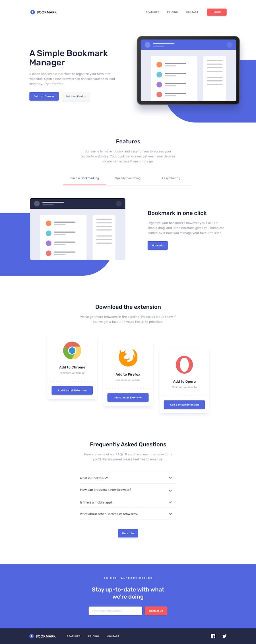
Design comparison
SolutionDesign
Solution retrospective
Any feedback/comments are highly appreciated 😊
Community feedback
- @ApplePieGiraffePosted almost 4 years ago
Hey, Itai! 👋
Good work on this challenge! Your solution looks pretty great! 👍
I suggest,
- Adding
overflow-xto thebody(or something similar) to prevent a horizontal scroll bar from appearing along the bottom of the page. - Perhaps preloading the images in the tabs section so that there is no delay between when the next tab is clicked and the image appears for the first time.
- Adding a
max-widthto the main container or wrapper so that the content of the page doesn't grow too wide on extra-large screens. - Adding a hover state to the button in the tabs section.
Keep coding (and happy coding, too)! 😁
1@georitPosted almost 4 years ago@ApplePieGiraffe Thank you so much. I just learned something new: preloading files 😊
0 - Adding
Please log in to post a comment
Log in with GitHubJoin our Discord community
Join thousands of Frontend Mentor community members taking the challenges, sharing resources, helping each other, and chatting about all things front-end!
Join our Discord
