Design comparison
Solution retrospective
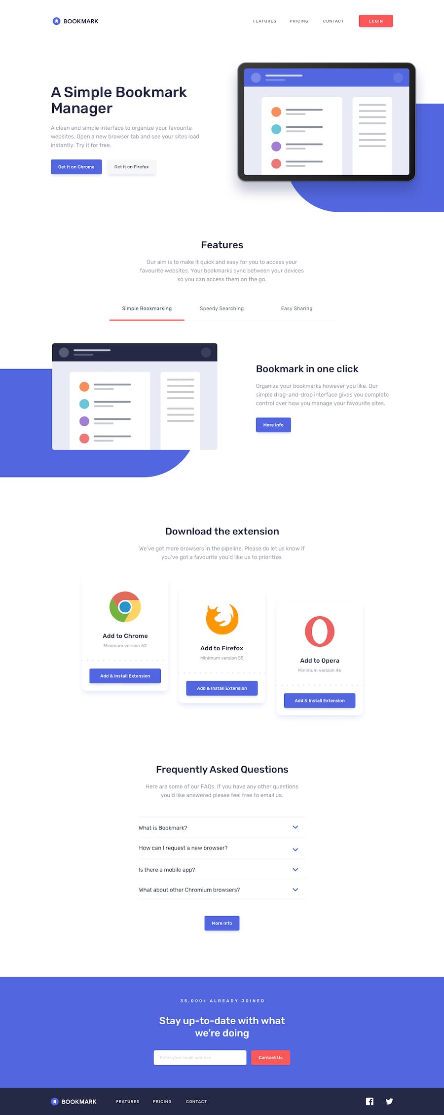
Hey dear judge friends, finally I've finished this challenge. I've gathered so many things through completing it. Anyway, I had to face a bad situation which is the blue background images. Actually, inside the starter file, there was no background image, and I've converted a div to a background image, in fact, it's not an image. It looks perfect in the viewport of the desktop, but in responsive design what I mean is in mobile or tablet viewport responsive design, it was so problematic that's why I've ignored these background divs without desktop design. Here I have two request for you -
- Please judge my code and give me feedback.
- If you have a bit of time, please redesign the viewport responsive background div for tab, mobile.
Community feedback
- @mdsalahuddin2001Posted almost 4 years ago
Very Nice Work. Keep going
1
Please log in to post a comment
Log in with GitHubJoin our Discord community
Join thousands of Frontend Mentor community members taking the challenges, sharing resources, helping each other, and chatting about all things front-end!
Join our Discord
