


Design comparison
Solution retrospective
I'm proud that I persisted in trying to get every section of the website to look relatively smooth and responsive (360px and above). There were times when I could have just left the design as it was but I took significant time to try and make little improvements on spacing and general responsiveness to the website.
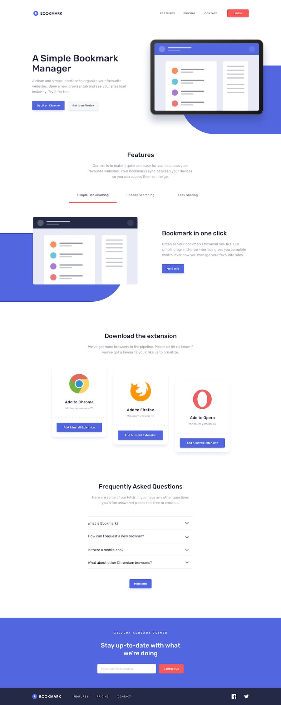
What challenges did you encounter, and how did you overcome them?Getting the download cards to be slightly offset from each other in the desktop design. To accomplish the offset effect, I increased the number of grid rows and adjusted their sizes for precise positioning of the elements mainly through trial and error.
 display: grid;
      grid-template-columns: repeat(3, 1fr);
      grid-template-rows: repeat(20, 25px);
      grid-column-gap: 2rem;
      grid-row-gap: 0px;

 .smol-card-component:first-child {
    @include mq(medium) {
      grid-row: 1/15;

     }


  }

  .smol-card-component:nth-child(2) {
    @include mq(medium) {
      grid-row: 3/17;

     }


  }

  .smol-card-component:nth-child(3) {
    @include mq(medium) {
      grid-row: 5/19;

     }
Questions:
-
How common is it for developers to cater to users with screen sizes of 320px? I imagine that the majority of users are no longer using devices like the iPhone 5, for example.
-
How far should you go when it comes to accessibility. I will add alt text and labels to buttons and other interactive parts of the site and test it with a screen reader but I have noticed that there are so many other things to follow when it comes to true accessibility, like focus trapping, form labels etc. For your average website should you be aiming to follow something like "The European Accessibility Act (EAA)"?
Community feedback
Please log in to post a comment
Log in with GitHubJoin our Discord community
Join thousands of Frontend Mentor community members taking the challenges, sharing resources, helping each other, and chatting about all things front-end!
Join our Discord