


Design comparison
Community feedback
- @ThabisoMagwazaPosted 12 months ago
This is very nice solution. I love how you got some of the complicated styling correct.
I woud, however, caution against straying from the design when implementing such challenges. It's an interesting test of your attention to detail when you attempt to get the final application to look as close to the design as possible.
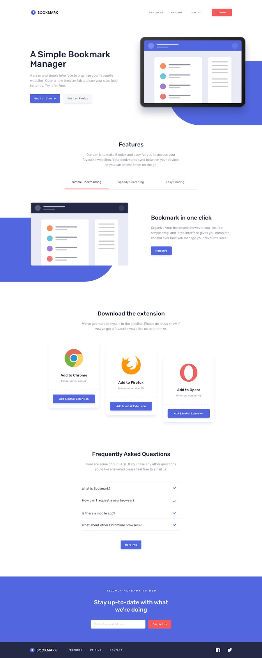
These are some of the areas I've identified where you strayed from the design:
- The font looks too small
- Your decorative blob doesn't seem to be responsive. It breaks on some screen sizes
- Validation and layout on the contact form doesn't look correct
I'm sure you can find a lot more. I suggest that you look throught the design again while paying close attention to the whitespace, hover and active stetes as well as any error states on forms e.t.c
You have an impressive grasp of CSS and I'm sure you'll benefit from the challenge!
Marked as helpful0

Please log in to post a comment
Log in with GitHubJoin our Discord community
Join thousands of Frontend Mentor community members taking the challenges, sharing resources, helping each other, and chatting about all things front-end!
Join our Discord