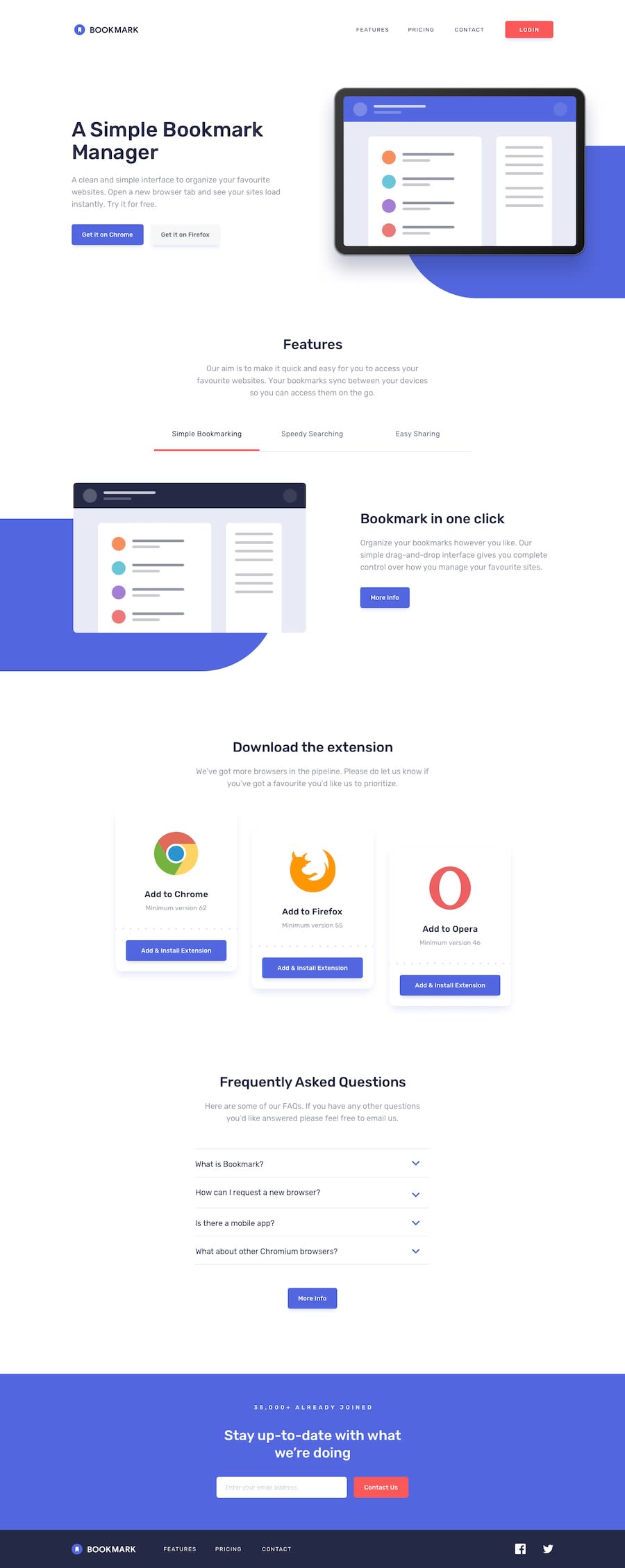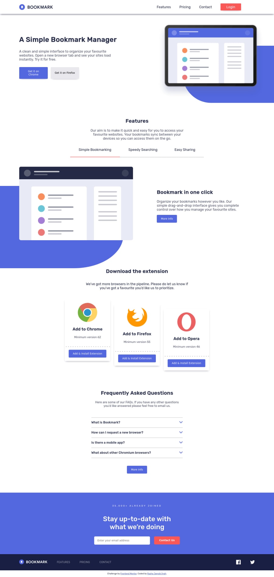
Design comparison
Solution retrospective
uhhh i have finished this challenge , i'm really having a hard time about responsive web do you have any suggestions ?
Community feedback
- @PhoenixDev22Posted over 2 years ago
Hello @Razha90,
Congratulation on finishing this challenging task with a lot to learn.
Excellent work! I have some suggestions regarding your solution if you don't mind:
HTML
NAVIGATION
- The logo's alternate text should not be
logo
. You can use the website's name as an alternate text. You may setalt=”Bookmark"
. If you are going to leave the logo not wrapped by<a>
, it’s better to place it out the<nav>
as it does not navigate the user in anywhere(only an image).
- It’s not recommended to add event listener on non-interactive elements. You can use a
<button>
with type=”button” around the svg’s.
close and open svgs
usually should be wrapped within the same interactive element<button>
.
- The toggle element should be added inside the nav, it would be better to be placed within the
<nav>
element. That way, assistive technology user will announce the button related to the<nav>
.
- The button needs to have an
aria-label attribute
or ansr-only
text that describes the button purpose. For example, you can have: aria-label='Mobile Navigation Trigger' or 'Open Menu.’
- Adding
aria-expanded
that, the user will be able to know that the button content is expanded or collapsed. At first, it has the “false” as a value then you use JavaScript to change the value.
- You should use
aria-controls
attribute on the toggle element, it should reference theid
value of the<ul>
element.
- Avoid creating duplicate content(duplicate navigation). You can style the same navigation in mobile and desktop differently using media queries. Practice like this can result in a poor user experience, when a visitor finds substantially the same content repeated within a set of search results.
- If you wish to draw a horizontal line which only for decorative purposes , it is not needed to be announced by a screen reader. You should do so using appropriate CSS. You may remove the
<hr>
, you can useborder-bottom:
to the list items.
- Don't capitalise in html, let css text transform take care of that. Remember screen readers won't be able to Read capitalized text as they will often read them letter by letter thinking they are acronyms.
For the tabbable content:
- Adding event listeners on non interactive element is not a good practice .
It is recommended to use a
<button>
element with the role tab for their built-in functional and accessible features instead, as opposed to needing to add them yourself.
- There different ways to make accessible tabbable content, The one I have used is combining the role tab with tablist with tabpanel to create an interactive group of tabbed content. If you don’t mind I’ll go step by step explaining the process:
- Each tab is a
<button>
withrole=”tab”
. - Wrapping the buttons is a container
<div>
withrole=”tablist”
. This combination identifies to assistive technology that the element is part of a group of related elements. - Each button should contain the
aria-controls
identifying the corresponding tabpanel by that element’s id. Alsoaria-selected
attribute set totrue
when it’s selected otherwise set tofalse
andaria-expanded
attribute - For each tabpanel, use an aria-labelledby attribute to provide an accessible name. References the tab element that controls the panel
- All of the tabpanel elements have tabindex="0" to make them tabbable, and all but the currently active one have the hidden attribute. The hidden attribute will be removed when a tabpanel becomes visible with JavaScript. you can read more in MDN.
- look up a bit more about how and when to write alt text on images. Learn the differences with decorative/meaningless images vs important content For decorative images, you set an empty
alt
to it with anaria-hidden=”true”
to remove that element from the accessibility tree. This can improve the experience for assistive technology users by hiding purely decorative images for example
- You might already be aware of this, but you can use the native HTML
details
andsummary
elements to quite easily make interactive accordions that are fairly accessible.
- Add
aria-label=”secondary “
oraria-label=”footer”
to the<nav>
in the footer. A brief description of the purpose of the navigation, omitting the term "navigation", as the screen reader will read both the role and the contents of the label. Thenav
element in the header could use anaria-label="primary"
oraria-label=”main”
attribute on it. The reason for this is that, you should add thearia-label
for a nav element if you are using thenav
more than once on the page.You can read more in MDN
- Forms with proper inputs and labels are much easier for people to use. To pair the label and input, one way is an explicit label’s
for
attribute value must match its input’sid
value. Input fields without accompanying labels can lead to accessibility issues for those who rely on screen readers. If a screen reader comes across an input field without a label it will try to find some accompanying text to use as the label. (To hide the label visually but present for assistive technology, you may usesr-only
class ).
- A button with no type attribute acts as type=”submit”, and will attempt to submit form data when clicked. Be explicit in your intentions and kind to future developers working with your code: provide a type. By specifying either button, submit or reset, the code’s purpose is clear and is easier to maintain, like in slide-button
- Instead of using a generic div to wrap the navigation links and social links , you put your links within an unordered list structure <ul> so that a screen reader will read out how many things are in the list to give visually impaired users the most information possible about the contents of the navigation.
- In this instance social icons, they do not navigate the user anywhere (they are not clickable). You should use interactive element
<a>
, for example:<li><a href=”#”><svg aria-hidden=”true” focusable=”false”>...</svg></a></li>
- Links must have discernible text. The social links wrapping the icons must have
aria-label
orsr-only
text indicate where the link will take the user. Within them the svgs, they are purely decorative, you'll need to manually add an aria-hidden attribute and focusable=”false” to each of your svgs, to avoid repitition and redundancy.
- In the footer’s logo , the SVG does not contain any visible text that describes the graphic, we need to add the alternative text (invisible) by:
<title>
A short title of the SVG</title>
- Add the appropriate ID’s to the
<title>
. - It must be the first child of its parent element
On the
<svg>
tag, add aria-labelledby="uniqueTitleID”.
I completed this challenge before, you can check my solution here, and please if you have any suggestions for improvements. please do leave a feedback. Aside these , Great job on this one. Hopefully this feedback helps.
Marked as helpful2@Razha90Posted over 2 years ago@PhoenixDev22 I WANT TO CRY WHEN READING THIS 😥 . This is the first time that my code has been read in full by someone . Thank You 😉😆
1@PhoenixDev22Posted over 2 years ago@Razha90 Glad to help and happy coding!
Marked as helpful1 - The logo's alternate text should not be
Please log in to post a comment
Log in with GitHubJoin our Discord community
Join thousands of Frontend Mentor community members taking the challenges, sharing resources, helping each other, and chatting about all things front-end!
Join our Discord