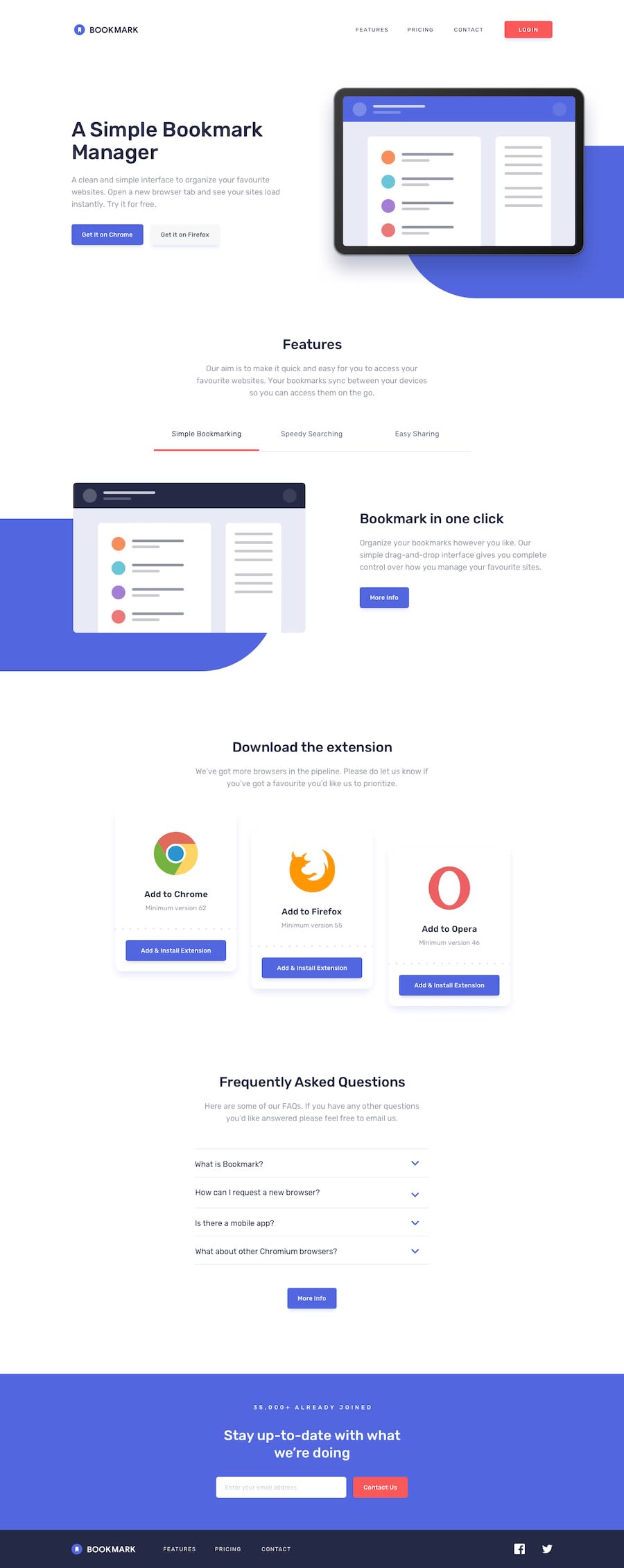
Design comparison
Solution retrospective
please tell me the cause of the horizontal scroll in mobile version. :<
Community feedback
- @mattstuddertPosted over 4 years ago
Awesome work, Norberto! I'm not actually getting a horizontal scroll on mobile. Have you fixed it? You've done a really good job on this challenge.
A couple of things you could do would be:
- Add form validation in the newsletter sign up
- Re-factor your JS for the features section to reduce code duplication. You've taken a good approach with looping over elements for the FAQ items. This would be a good approach for the feature section as well.
You've done a really good job. Keep up the great work! 👍
0@theAspiringDev1Posted over 4 years ago@mattstuddert Thanks man! Ill refactor it. Google chrome has that weird horizontal scroll xD. and up till now i dont even know what was causing it
0@mattstuddertPosted over 4 years ago@theAspiringDev1 ah yeah, I've just seen it. Setting
overflow-x: hiddenon thebodydoesn't work. I can't remember the exact reason but the way to resolve it is to add an element just inside that wraps all of the content like this:<body> <div class="wrapper"> </div> </body>Then add it to the
.wrapperclass instead. It will be because of your absolutely positioned background patterns. Let me know if that resolves it! 👍0@theAspiringDev1Posted over 4 years ago@mattstuddert That fixed it! Thank you ! I learned from it!
0
Please log in to post a comment
Log in with GitHubJoin our Discord community
Join thousands of Frontend Mentor community members taking the challenges, sharing resources, helping each other, and chatting about all things front-end!
Join our Discord
