Submitted 4 months ago
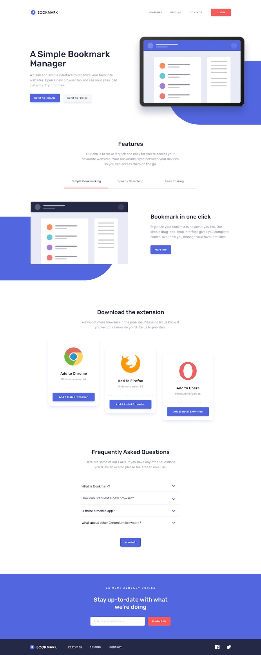
Bookmark Landing Page
#next#react#tailwind-css#typescript#framer-motion
@robcrock
Design comparison
SolutionDesign
Solution retrospective
What are you most proud of, and what would you do differently next time?
These project are getting easier and easier to complete. I have been extremely surprised by the skill development.
What challenges did you encounter, and how did you overcome them?Nothing too bad. I'm learning to leverage AI more and more.
What specific areas of your project would you like help with?Let me know how I could animate the form error message in a clever way.
Community feedback
- @MikDra1Posted 4 months ago
WOW!
Really good work! One thing that you should improve is the horizontal scroll. To prevent this from happening use this code snippet:
.container {
overflow-x: hidden;
//or
overflow: hidden;
}
Hope you found this comment helpful 💗💗💗
Good job and keep going 😁😉😊
1@robcrockPosted 4 months ago@MikDra1 that's a great call out! Thank you for taking a look and sharing this support.
0
Please log in to post a comment
Log in with GitHubJoin our Discord community
Join thousands of Frontend Mentor community members taking the challenges, sharing resources, helping each other, and chatting about all things front-end!
Join our Discord
