Design comparison
Solution retrospective
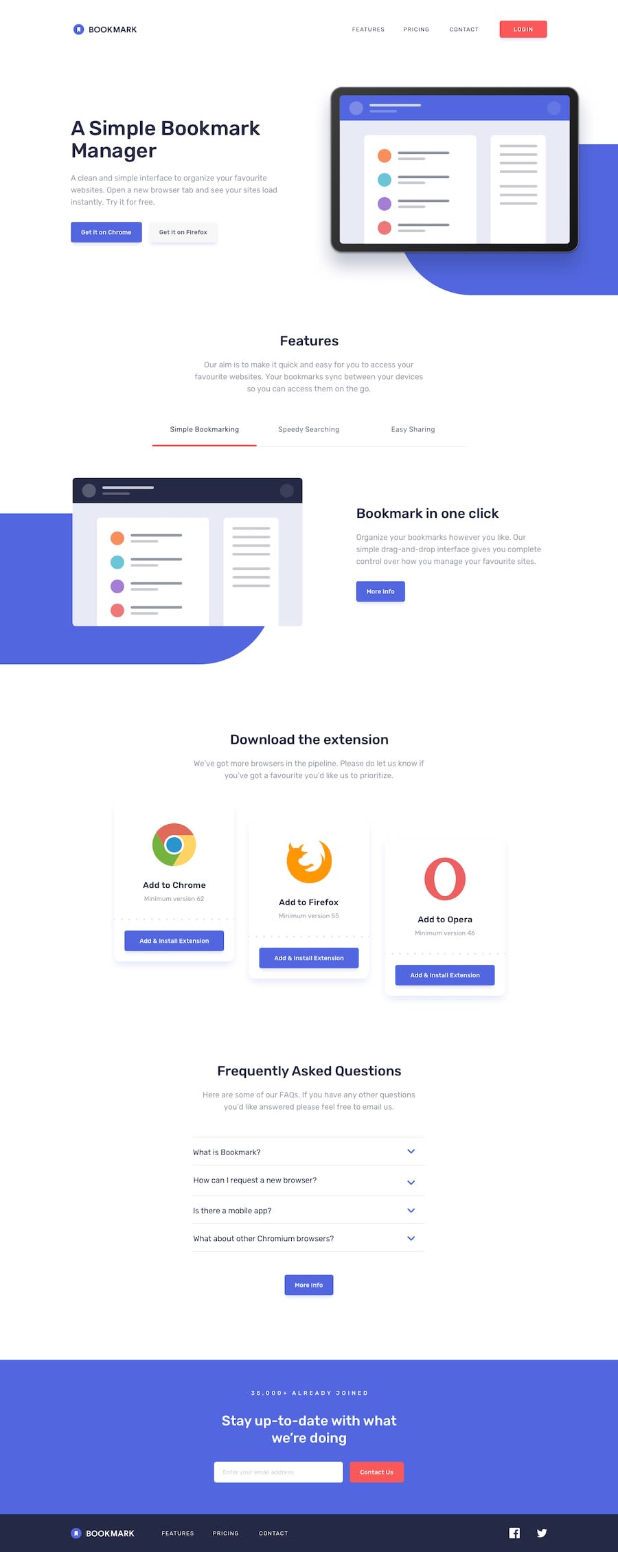
Hey, guys check out my solution for Bookmark Landing Page took me some time to do it using Tailwind CSS. Also, check out my code, and do suggest some improvements to help me improve. Thanks ✌.
Community feedback
- @ChristopherParkePosted over 2 years ago
Not too bad. I see from the screenshot that the footer is not quite sticky. You can fix this by making the body have height of 100vh. I also like to make the body display as a grid. I do this because I like to make the page layout with grid since it's 2 dimensional, instead of 1 (like flexbox).
body {
     display: grid;
     height: 100vh;
}
Also, your mobile design is quite off. You should inspect your page with the "device toolbar" active in the dev tools. You will see that you have a side scrollbar and things aren't the right size or alignment.
Marked as helpful0@SOURABH358Posted over 2 years ago@ChristopherParke Thanks for your review. Some last moment changes messed up the mobile design. Thanks for reviewing. 👍
0
Please log in to post a comment
Log in with GitHubJoin our Discord community
Join thousands of Frontend Mentor community members taking the challenges, sharing resources, helping each other, and chatting about all things front-end!
Join our Discord
