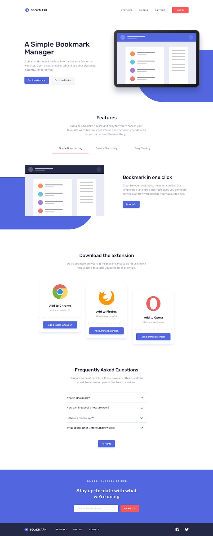
Design comparison
Solution retrospective
It took too much time because there was something unexpectedly blocked in the small areas. I'm proud to have implemented it similarly.
What challenges did you encounter, and how did you overcome them?I've been struggling with the background behind the illustration, so I'm barely close to it, but from now on, I'll have to look at how to mark up and start from the beginning.
What specific areas of your project would you like help with?Anything you have found. How long will it take to finish normally?
Community feedback
- @BT453567Posted 4 months ago
Hello
Excellent solution. There are many parts I like about this solution.
I have identified a small issue where the logo is not visible in the mobile menu.
If you uncheck the text indent the logo is visible in the menu.
Rather than re-creating the facebook and twitter logo for the mobile menu, you could manipulate the DOM from Javascript, by using the following commands (This is taken from my solution):
footerSocialsContainer.remove(); mobileMenuFooterContainer.appendChild(footerSocialsContainer);
I like how you calculated the distance of the graphic to edge of the screen and also how you implemented the tab buttons.
I also found it took longer than expected to code.
Hope that helps
Marked as helpful0@Yejin-HanPosted 4 months ago@BT453567 Thank you for your feedback! I miss that logo visibility issue. I fix it. Thanks :) I didn't manipulate the DOM because I thought it would be bad in terms of performance or maintenance. But I'll try it next time.
0
Please log in to post a comment
Log in with GitHubJoin our Discord community
Join thousands of Frontend Mentor community members taking the challenges, sharing resources, helping each other, and chatting about all things front-end!
Join our Discord
