Bookmark landing page using Astro 🚀 and React
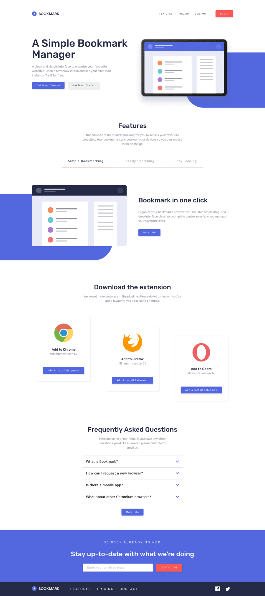
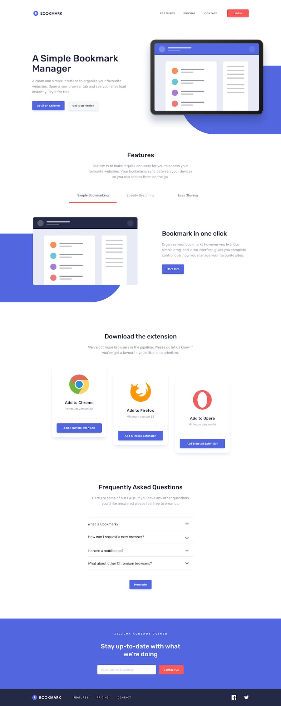
Design comparison
Solution retrospective
👋 Hi, guys!
Here is my solution to the 'Bookmark landing page' challenge 🎉
I used Astro framework for this challenge with React integration.
So to sum up I used:
- Astro
- React
- Framer Motion
🤝 Happy to hear any feedback and advice.
Community feedback
- Account deleted
There is a tiny bug on this page. When open toggle menu and increase the width of the page (turning back to desktop sizes) mobil menu leaves open and close button disappear so user stuck with mobil nav menu. Accept that you have got great job for this page. Happy coding : )
Marked as helpful1@JaneMorozPosted over 2 years ago@GorkemEldeniz Thank you! I'll fix it ☺️ Happy coding to you too 😀
1 - @fazzaamiarsoPosted over 2 years ago
Hi Eugenia! Nice Work!
I have a tip for you.
I saw that you fully use react for your header component. You can improve it further by only react-ify (sorry don't know the word) the
Menu.You just need to turn this section into react and move the
navIsOpenstate into the component.{!navIsOpen && ( <button aria-label="navigation toggle" className="header__mobile-btn btn btn--hamburger" type="button" onClick={() => setNavIsOpen(!navIsOpen)} > <HamburgerIcon /> </button> )} {navIsOpen && ( <MobileNav setNavIsOpen={setNavIsOpen} navIsOpen={navIsOpen} /> )}So your
Header/index.tsxbecomesHeader/index.astro.--- // Header logics --- <header> // header codes <Menu client:load /> </header>I hope it helps! Cheers!
Marked as helpful1
Please log in to post a comment
Log in with GitHubJoin our Discord community
Join thousands of Frontend Mentor community members taking the challenges, sharing resources, helping each other, and chatting about all things front-end!
Join our Discord
