Design comparison
Solution retrospective
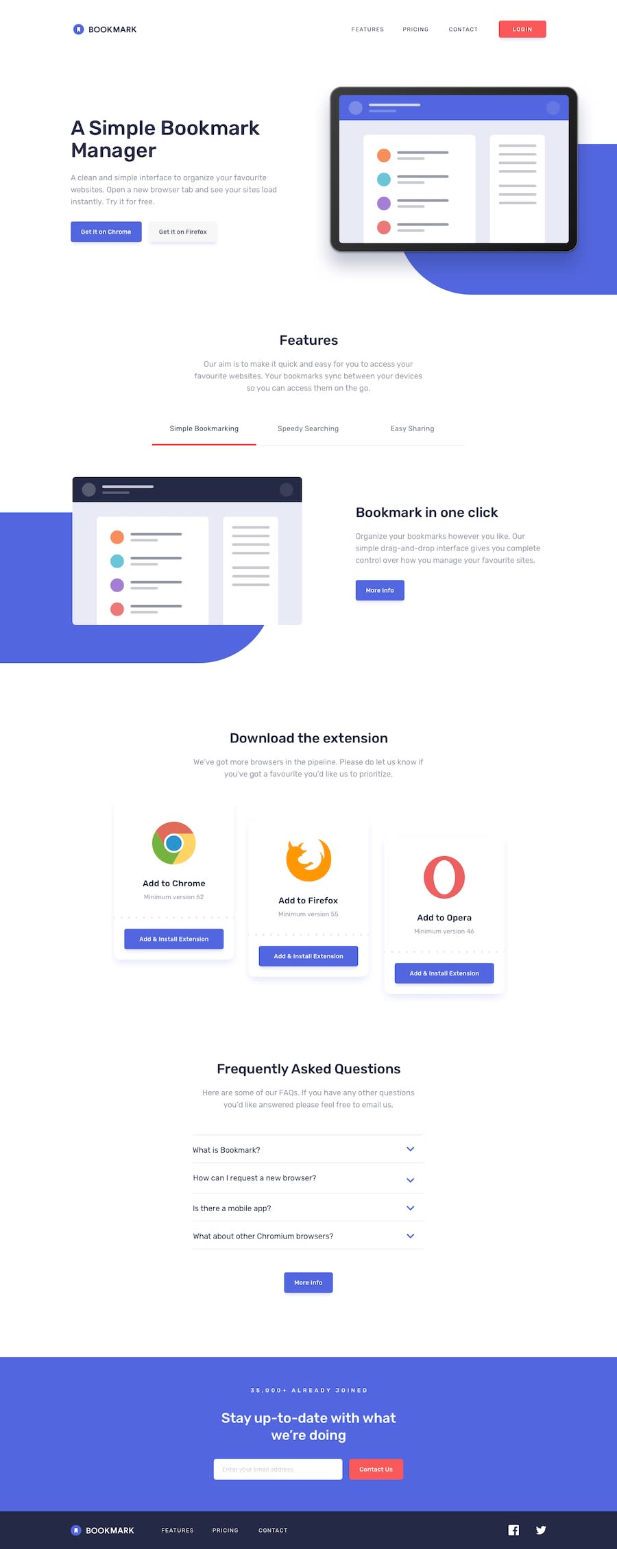
Please, your review is needed. I couldn't centre my intro and tabs buttons. Same with the FAQS arrow svg stroke `color when active. How do I achieve these? Thank you in advance.
Community feedback
- @mattstuddertPosted almost 5 years ago
Nice work Solomon. I'm not 100% sure what you mean about the intro tabs and buttons. At what screen sizes are you talking about? To change the color of the SVG you need to change the
strokeproperty of thepathinside of thesvgelement. Keep up the great work. I'd recommend having one final round of refinements, especially on the responsive side to try and get it as close to the design as possible 👍0@krebeDevPosted almost 5 years agoThanks, @mattstuddert. I meant the two inline buttons for the intro section and the (More info) button in each tabbed content area. The screen size is 860px and below.
I'll try the
SVGstroke.Also, please, how will you rate my JavaScript code/logic? I find myself using lots of loops and I wonder if that can lead to performance issues on a larger project. Plus, I think my code is quite verbose; I'll love to hear from you on these, and my JS code in general.
0@mattstuddertPosted almost 5 years ago@krebeDev when you're writing plain JS you need to have those loops to assign event listeners to a set of elements, so it's very normal. Your code looks good. Just look out for opportunities to refactor duplicated code. For example, your
deactivateStatesandhidePreviousfunctions are identical, so could be updated.0@krebeDevPosted almost 5 years agoThanks, @mattstuddert. I'll review and refactor all my codes on the challenges I've completed.
0
Please log in to post a comment
Log in with GitHubJoin our Discord community
Join thousands of Frontend Mentor community members taking the challenges, sharing resources, helping each other, and chatting about all things front-end!
Join our Discord
