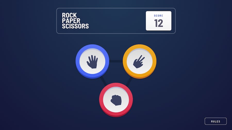
bonus Rock-Paper-Scissors Angular SPA with animations and SCSS styling
Design comparison
Solution retrospective
I'm so putting this on my portfolio.
Community feedback
- @DundeeAPosted about 2 years ago
Great job completing this challenge, I have just a couple suggestions to improve.
Typescript: After testing I realized its possible to get negative points when you lose with a score of '0'. You can fix this issue quite easy by adding an if statement right before you subtract a point.
if (this.score != 0) { this.score -= 1; }Accessibility: Your buttons don't have an accessible name, screen readers announce it as "button", making it unusable for users who rely on screen readers. You can add an accessible name to a button by adding an aria-label.
Example:
<button aria-label="scissors"> </button>Marked as helpful1@zofia-mmPosted about 2 years ago@DundeeA
I knew how to fix negative score, I just like it this way. My low score is -10.
Thanks for the feedback on accessible button names. I was confused, when the report brought it up.
1
Please log in to post a comment
Log in with GitHubJoin our Discord community
Join thousands of Frontend Mentor community members taking the challenges, sharing resources, helping each other, and chatting about all things front-end!
Join our Discord
