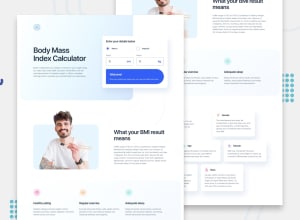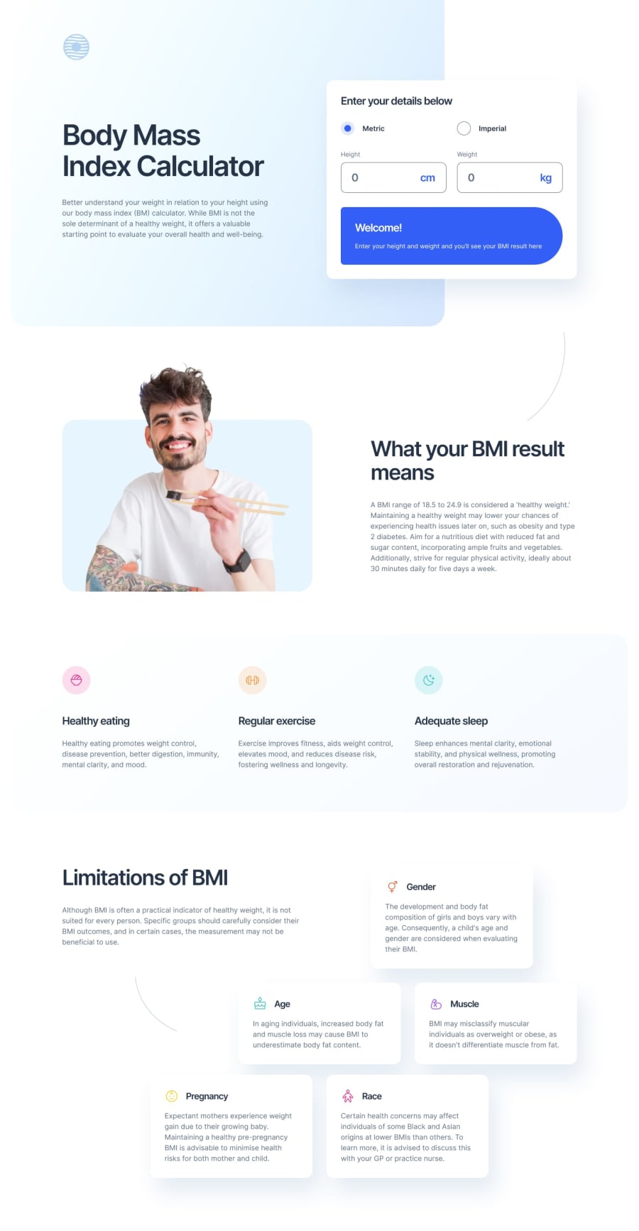
Design comparison
SolutionDesign
Solution retrospective
Hey, Frontend community 👋
In this project, the main focus was on replicating functionality using React and enhancing this project with a button that toggles between light and dark themes. This was not an easy task. I am aware that my CSS could look better, but I plan to refine it at a later time.
Your feedback and suggestions are greatly appreciated, as they will contribute to my growth as a frontend developer. Thank you for taking the time to examine my project!
Community feedback
Please log in to post a comment
Log in with GitHubJoin our Discord community
Join thousands of Frontend Mentor community members taking the challenges, sharing resources, helping each other, and chatting about all things front-end!
Join our Discord
