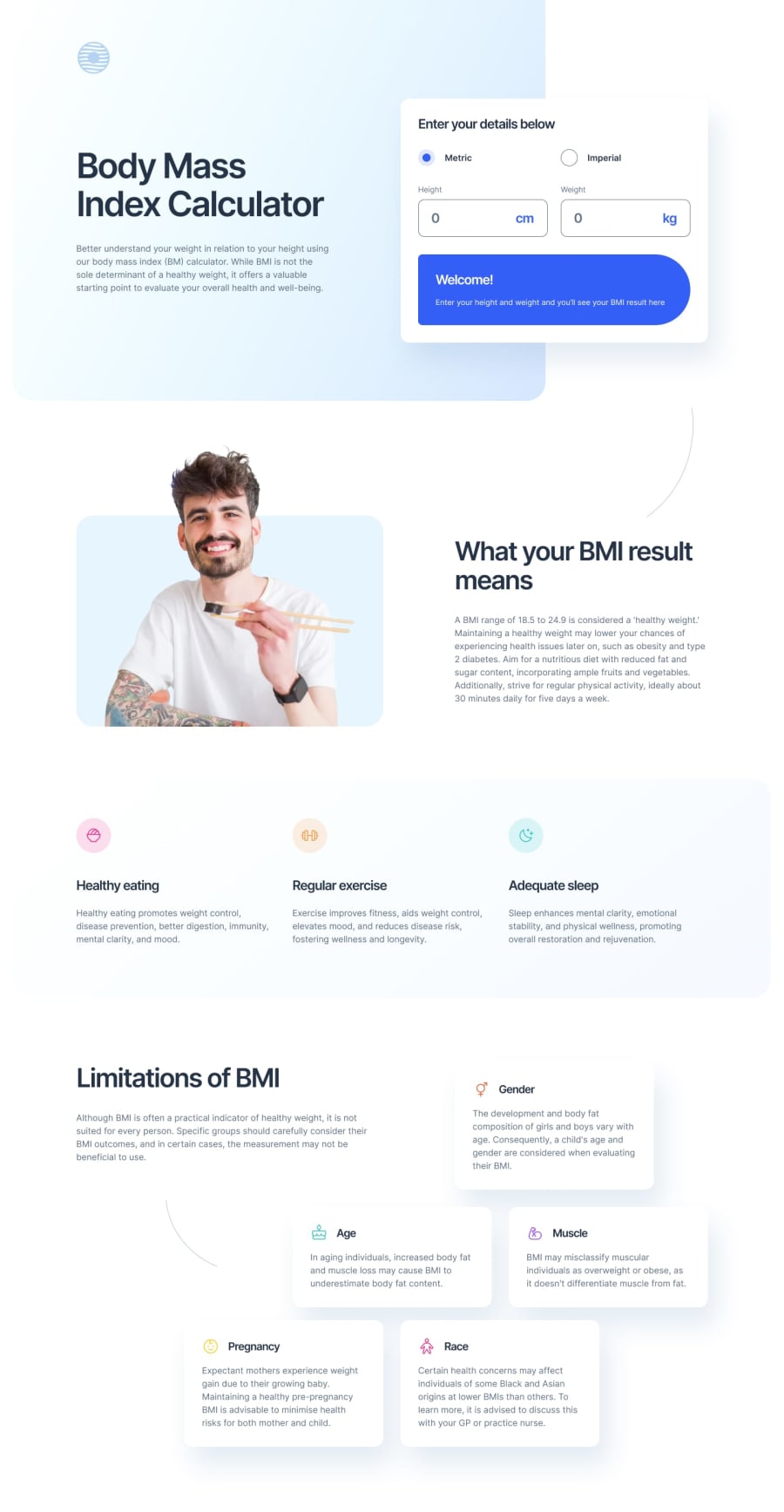
Design comparison
Solution retrospective
This was a very entertaining project, full of challenges and new things to learn.
The layout was a bit complex, as it varied significantly across viewports, making it difficult to maintain a 'fluid' layout that adapted autonomously. This forced me to use several media queries to control this behavior, always following a 'mobile-first' approach.
The calculator itself wasn't too difficult, but keeping track of all the data and outputs was a bit cumbersome, especially automating responses as much as possible, like the automatic measurement conversion or real-time input error checking.
As always, I look forward to your feedback and appreciate it in advance.
Community feedback
Please log in to post a comment
Log in with GitHubJoin our Discord community
Join thousands of Frontend Mentor community members taking the challenges, sharing resources, helping each other, and chatting about all things front-end!
Join our Discord
