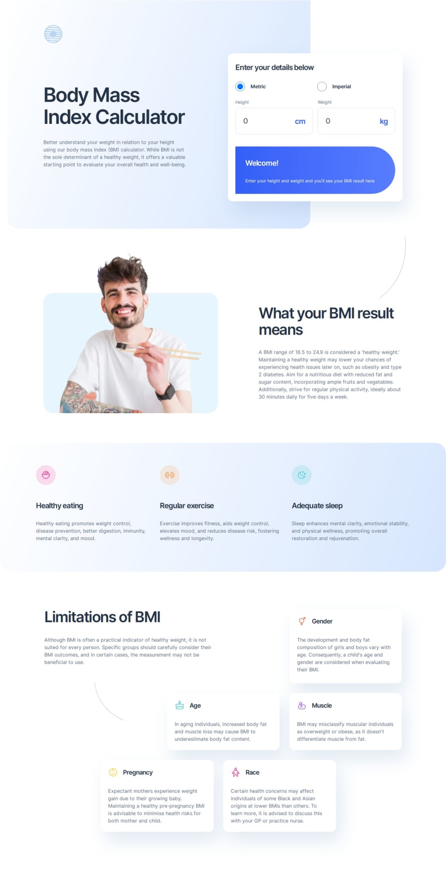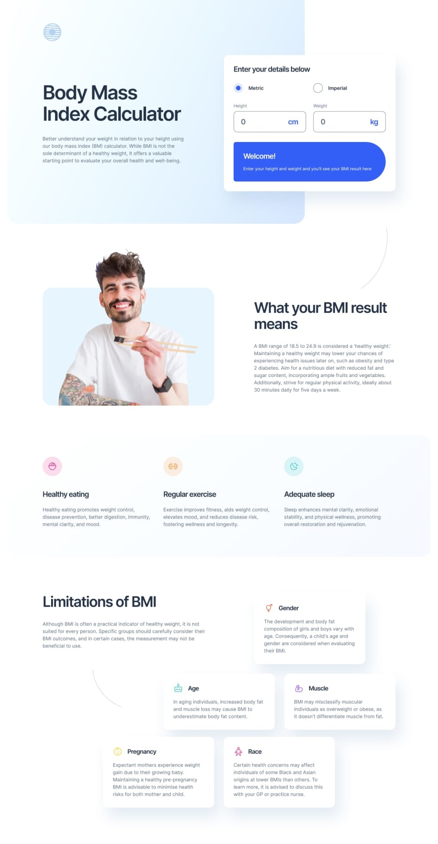
Design comparison
SolutionDesign
Solution retrospective
What are you most proud of, and what would you do differently next time?
I'm proud of the overall outcome, making it responsive and implementing the functionality to get the get the required result.
What challenges did you encounter, and how did you overcome them?Getting this layout responsive was not easy and straight forward as I initially thought specifically the hero section. I had to use the :before pseudo element on the header to get the blue shade background so that the calculator and the heading should adjust without breaking when the screen is resized.
All feedback is welcomed. Thanks!
Community feedback
Please log in to post a comment
Log in with GitHubJoin our Discord community
Join thousands of Frontend Mentor community members taking the challenges, sharing resources, helping each other, and chatting about all things front-end!
Join our Discord
