body { background: hsl(217, 54%, 11%); font-family: "Outfit",
Design comparison
Solution retrospective
i have trouble understanding on how to creates git pages
Community feedback
- @spidermonkey356Posted over 2 years ago
If you want to host it on Github, you should be able to move the files to your repo directly in the main branch.
Once you have done this, go to settings (this is for your current repository and should be on the top bar), then go to pages. (this is on the left-hand sidebar) There should now be a section called "Source" with the following. "GitHub Pages is currently disabled. Select a source below to enable GitHub Pages for this repository." There should be a button below this that currently says none. Click on it and change it to main. Click save, this will create a URL where your new site is hosted. It will take a couple of minutes for Github to properly host it, but after a couple of minutes when you visit the new URL it gave you, you should be able to see your project.
This helped me, I had the same problem, and the Github knowledge was given to me by Kent O 'Sullivan.
1 - @PhoenixDev22Posted over 2 years ago
Hello Feisal,
Great work! I have some suggestions regarding your solution:
HTML
-
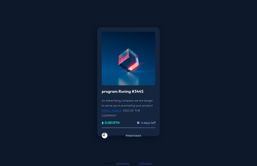
There should be two landmark elements as children of the body element - a
main
(which will be the NFT component ) and afooter
(which will be the attribution).<Footer>
should not be in the<main >
. HTML5 landmark elements are used to improve navigation . -
Page should contain a level-one heading. For future use , use the headers in a chronological order. How you order headings dictates how a screen reader will navigate through them. As you go down a level, the number should increase by one, like a numbered list within an outline. In this challenge , as it’s not a whole page, you can have
<h1>
visually hidden withsr-only
class and use<h2>
forEquilibrium #3429
. -
The link wrapping the equilibrium image(
image-equilibrium
) should either haveSr-only
text, anaria-label
oralt
text that says where that link takes you. -
Images must have alternate text.
-
Attribute alt not allowed on element a at this point.
-
Links must have discernible text. Though the
icon-view
image doesn’t really need to be in the html, you can use CSS for this as there is no need for another clutter in the HTML. -
For any decorative images, each img tag should have empty
alt=""` and add
aria-hidden="true"`` attributes to make all web assistive technologies such as screen reader ignore those images in(icon-view, icon-ethereum, icon-clock
). -
You can use unordered list
<ul>
to wrap the inner part of the card above the avatar’s one. In each<li>
should be<img>
and<p>
that way you can align them centrally. -
The avatar's alt should not be ** avatar**. You can use the creator's name
Jules Wyvern
. Read more how to write an alt text -
If you wish to draw a horizontal line, you should do so using appropriate CSS. Remove the
<hr class="divider" />
, you can use border-top: to the avatar's part -
To use more semantic tags , you may use
<figure>
and<figcaption>
for the avatar's part. -
For future use, It’s better not to capitalise in html
(CEO OF THE COMPANY)
, let css text transform take care of that. Remember screen readers won't be able to Read capitalised text as they will often read them letter by letter thinking they are acronyms.
CSS:
-
Add
min-height: 100vh
instead ofheight: 100vh
to the body that let the body grows taller if the content outgrows the visible page instead. -
There are so many ways to add the hover effect on the image , The one I would use, using pseudo-elements to change the teal bg color to a hsla. Then opacity can be changed from 0 to 1 on the pseudo element on hover.As there’s no need for extra clutter to the HTML.
-
width: 350px; an explicit width is not a good way. consider using max-width to the card instead.
-
height: 600px;
It's not recommended to set height to component, let the content of the component define the height.-
Consider using rem and em units as they are flexible, specially for font size
-
In
line-height: 30px ;
use unitless value for theline-height
, this is the preferred way to set line-height and avoid unexpected.Read more in MDN. -
Using percentages for widths, max-width and avoiding to set heights for the components , with these things is the key to mastering responsive layouts.
Aside these, Great work on this one. Hopefully this feedback helps.
0 -
Please log in to post a comment
Log in with GitHubJoin our Discord community
Join thousands of Frontend Mentor community members taking the challenges, sharing resources, helping each other, and chatting about all things front-end!
Join our Discord