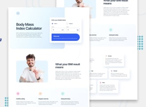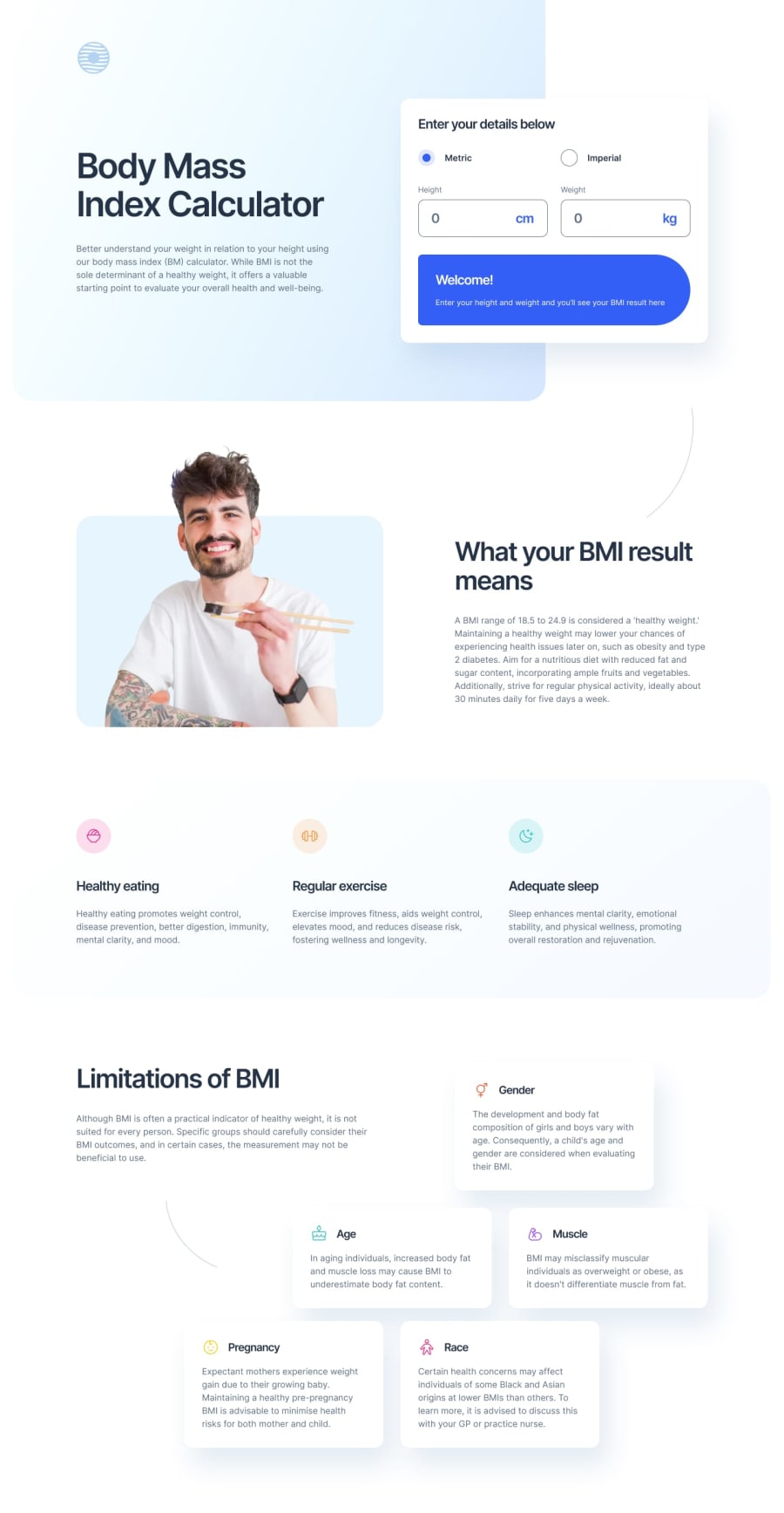
Design comparison
SolutionDesign
Community feedback
- @mirkobozzettoPosted 6 months ago
some curved lines are missing from the layout and the colour gradients are a little different, but overall it's pretty good
there's also a bit of padding missing, as everything sticks to the example provided in the resources
and you did provide the inputs for the bmi, but I'd have liked the bmi result to be displayed after you'd provided the information in the welcome block, even if that wasn't requested, it might have been nice to use js ;-)
PS: well done for the scss, everything is well organised and very clear!
Marked as helpful0
Please log in to post a comment
Log in with GitHubJoin our Discord community
Join thousands of Frontend Mentor community members taking the challenges, sharing resources, helping each other, and chatting about all things front-end!
Join our Discord
