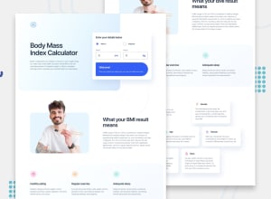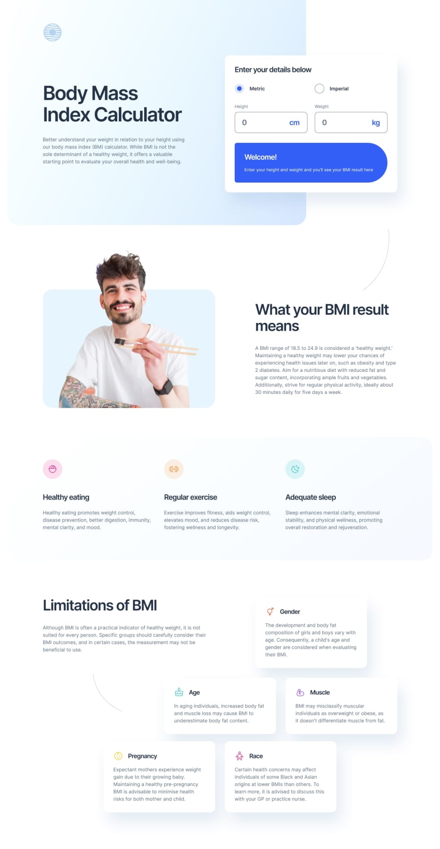
Design comparison
Solution retrospective
I was able to figure out how to calculate ideal weight range based on the inputted height. It wasn't a necessary part of the design instructions but it would have bothered my ocd if I didn't attempt to address it. So that was something that was a little confusing but felt good to figure out.
What challenges did you encounter, and how did you overcome them?For the limitations section, I couldn't figure out how to position the boxes. I ended up using a combination of flex box and absolute positioning
What specific areas of your project would you like help with?I want to figure out how to not use absolute positioning here. I feel that there is a way to organize the limitation boxes in a way using css grid but I wasn't able to figure it out.
Community feedback
Please log in to post a comment
Log in with GitHubJoin our Discord community
Join thousands of Frontend Mentor community members taking the challenges, sharing resources, helping each other, and chatting about all things front-end!
Join our Discord
