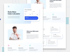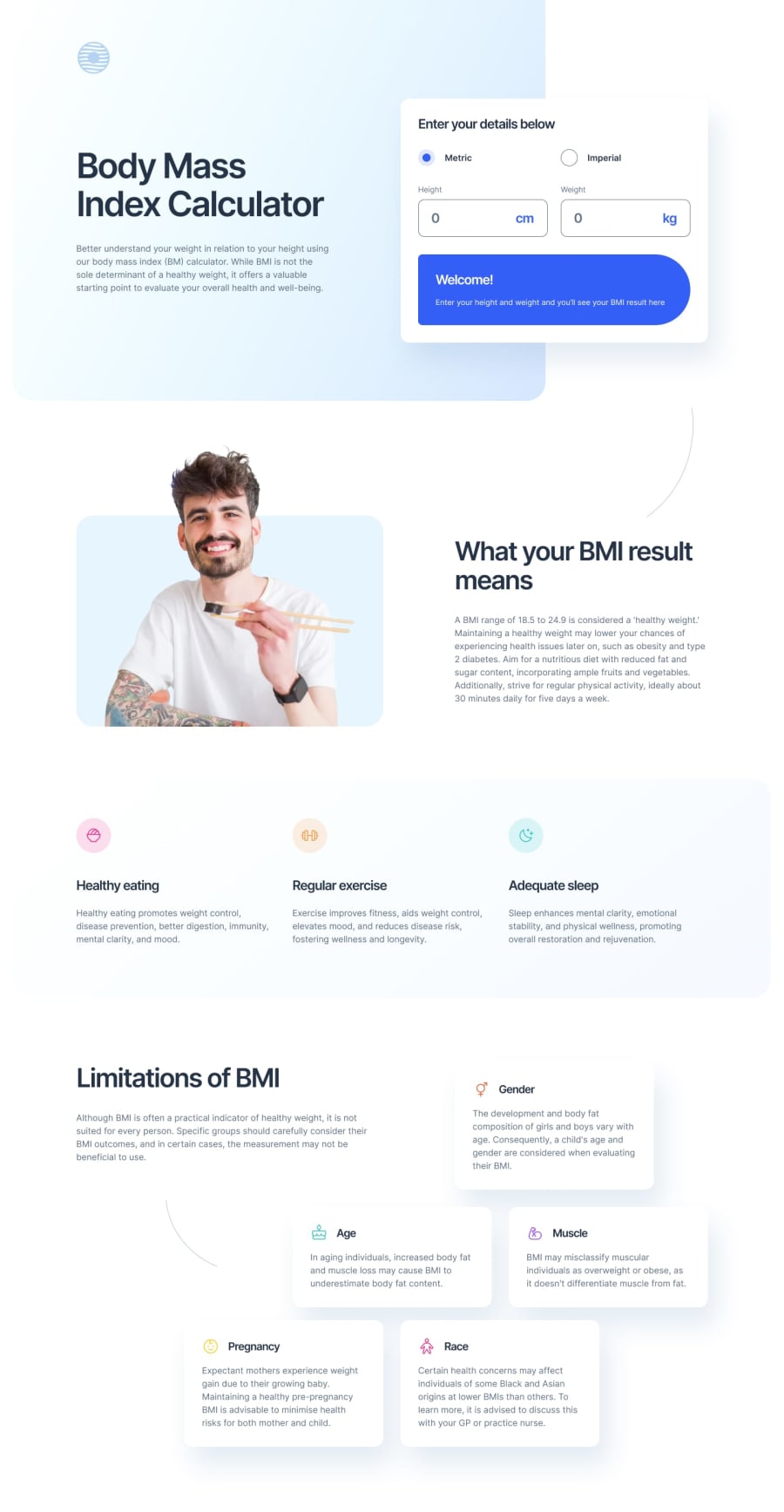
Design comparison
Solution retrospective
I decided to restart this project after almost finishing the whole thing to change the tech from Flexbox and positioning to Grid and it was absolutely the correct thing to do despite being a lot of work.
Grid really is fantastic and unless a layout is very simple I'll opt for Grid over Flexbox from now on.
The only thing I'm not sure about is the gradients don't look quite right but looking at the Figma files all the values are the same so I'm not sure what's wrong here.
Community feedback
- @ttsoaresPosted about 1 year ago
Greetings. Neat front !
Could you please explain how to produce the BMI calculation ?
I filled with 80Kg and 190cm but nothing happens...
1@mikehwebdevPosted about 1 year ago@ttsoares Oh that's weird I had a strange script tag issue. I've fixed that now and entering your height and weight will give you your BMI :)
0
Please log in to post a comment
Log in with GitHubJoin our Discord community
Join thousands of Frontend Mentor community members taking the challenges, sharing resources, helping each other, and chatting about all things front-end!
Join our Discord
