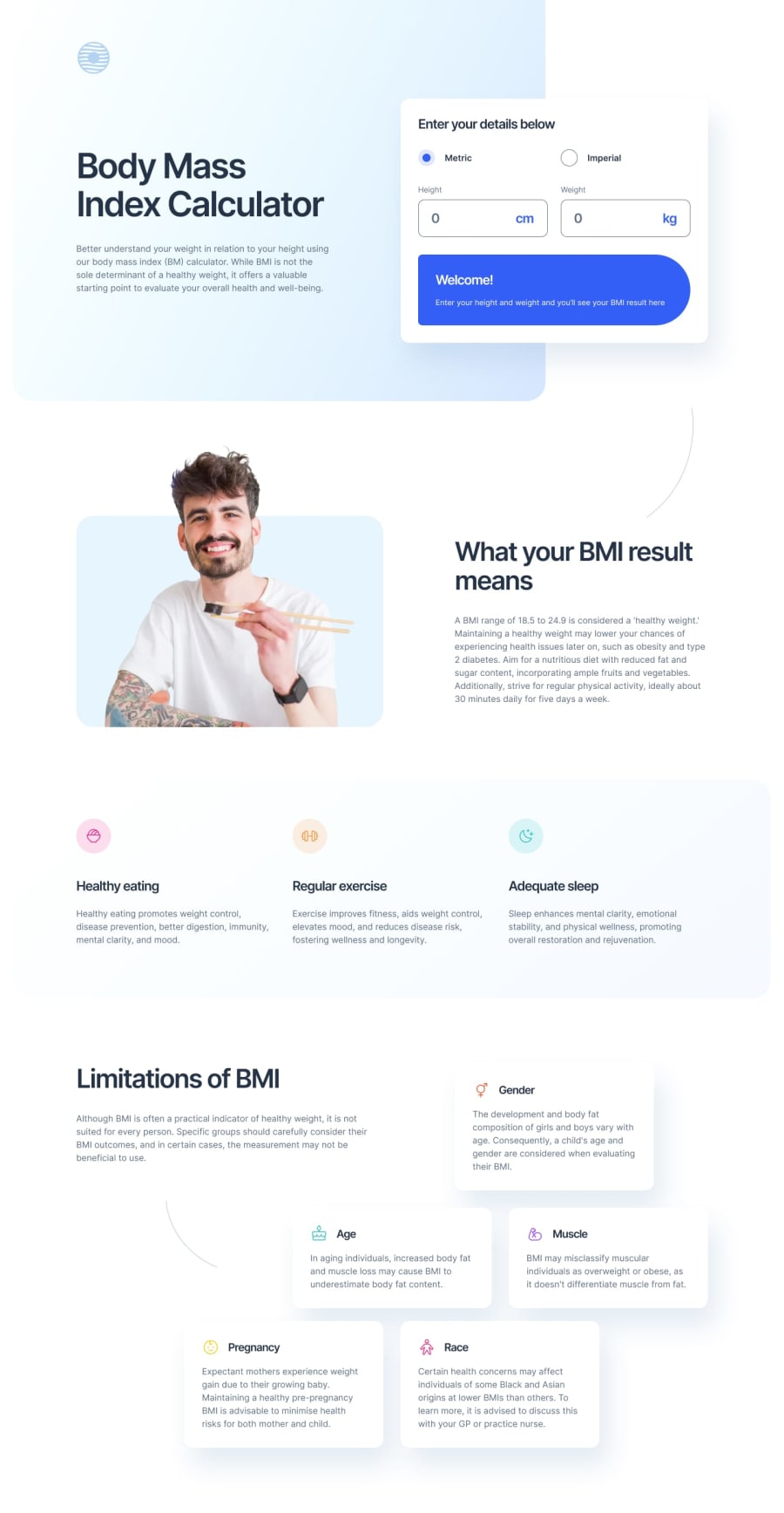
BMI Calculator using TypeScript & Tailwind
Design comparison
Solution retrospective
I appreciate any helpful feedback.
Community feedback
- @MohammedOnGitPosted 3 months ago
Hello Dan Marius!
Your HTML structure for the Body Mass Index Calculator looks well-organized and structured for a responsive and interactive page. Here are a few suggestions and best practices to improve your code:
- Improve Form Accessibility Add aria-label attributes or descriptive labels where necessary to enhance accessibility. For instance, for the radio buttons, you can explicitly associate labels and improve accessibility for screen readers:
<input class="accent-blue size-[1.9375rem]" type="radio" name="units" id="units_metric" value="metric" aria-label="Use Metric units" checked /> <input class="accent-blue size-[1.9375rem]" type="radio" name="units" id="units_imperial" value="imperial" aria-label="Use Imperial units" />- Input Types In the input elements for height and weight, the name attribute should be unique and reflective of the field. You currently have multiple fields with name="height"; you should change them to ensure each field has a distinct name:
<input type="number" name="height_metric" id="height_primary" ... /> <input type="number" name="height_imperial" id="height_secondary" ... /> <input type="number" name="weight_metric" id="weight_primary" ... /> <input type="number" name="weight_imperial" id="weight_secondary" ... />- Use for Attributes in Labels Ensure that all labels use the for attribute to associate them with their corresponding form elements for better form accessibility:
<label for="units_metric">Metric</label> <label for="units_imperial">Imperial</label>-
Viewport Consistency In responsive design, ensure the image sizes are well-scaled for different devices. Using relative units (vw, vh, em, or rem) instead of fixed sizes (px) for widths and heights could improve adaptability.
-
Input Validation If you’re expecting specific input ranges (e.g., minimum and maximum height or weight), it’s helpful to add HTML validation by setting min, max, and step attributes:
<input type="number" name="height_metric" id="height_primary" min="0" max="300" step="0.1" ... /> <input type="number" name="weight_metric" id="weight_primary" min="0" max="300" step="0.1" ... />- Alt Text for Decorative Images For decorative images (like pattern-curved-line-left.svg), the alt attribute should be set to an empty string ("") to ensure screen readers skip them:
<img src="/images/pattern-curved-line-left.svg" alt="" />Overall, your structure looks solid, and following these best practices will ensure better accessibility, usability, and performance of your BMI Calculator.
Marked as helpful0
Please log in to post a comment
Log in with GitHubJoin our Discord community
Join thousands of Frontend Mentor community members taking the challenges, sharing resources, helping each other, and chatting about all things front-end!
Join our Discord
