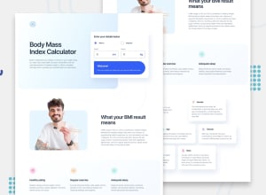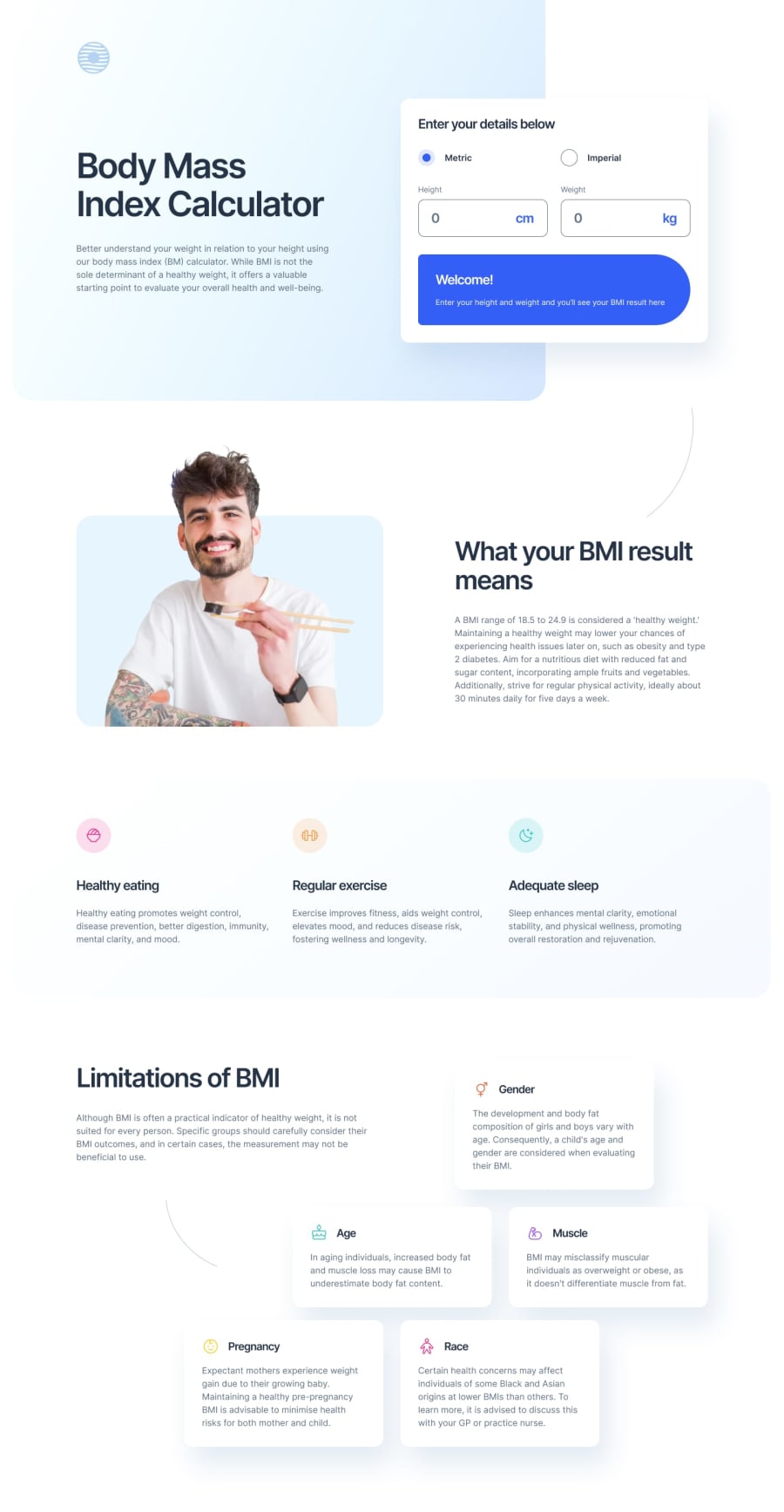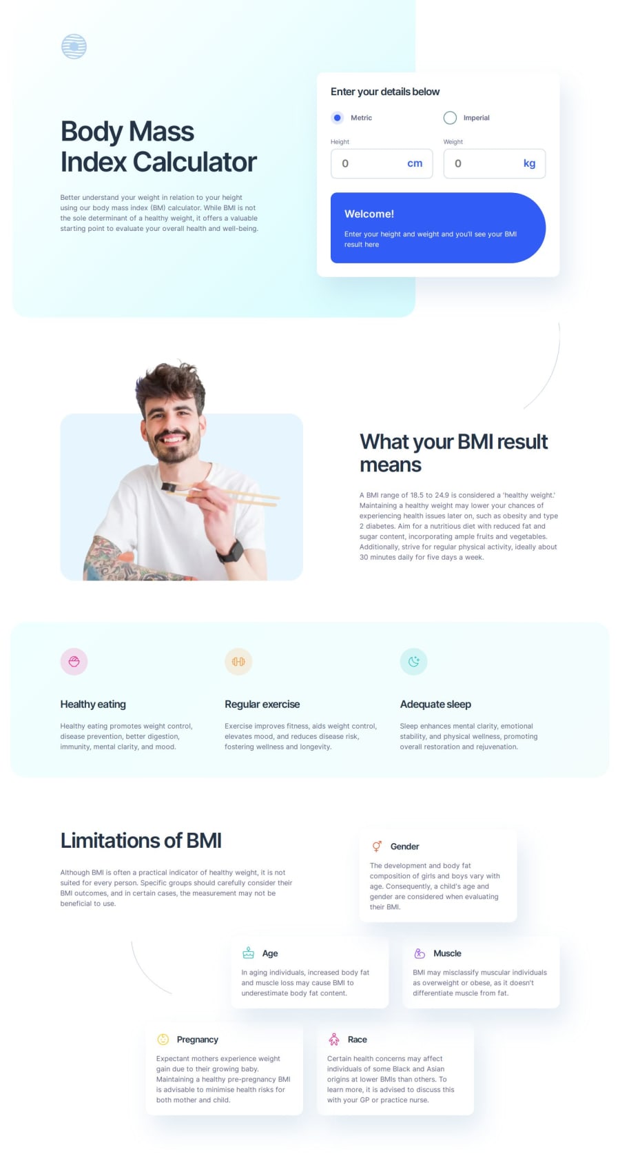
Design comparison
Solution retrospective
I am most proud of successfully implementing a practical challenge that focused on accessibility while also being challenging in terms of CSS. If I were to do it again, I would definitely use React and Tailwind to streamline the development process and enhance the user experience.
What challenges did you encounter, and how did you overcome them?The main challenges I encountered were ensuring the calculations were done correctly and displayed to the user, and making sure the inputs and radio buttons were accessible and the screen reader worked properly. I overcame these challenges by thoroughly testing the calculations and ensuring that all elements were accessible and compatible with screen readers.
What specific areas of your project would you like help with?I would like help with CSS, accessibility, and the project’s JavaScript code. Feedback in these areas would be greatly appreciated to improve the overall quality and functionality of the project.
Community feedback
- @grace-snowPosted about 2 months ago
Hello - Moved the feedback here so it's easier to find.
As I already said in Discord, I'm very impressed with how much thought you've put into accessibility considerations in this!! Really well done. I hope my insights as a senior accessibility consultant help bring some extra clarity for you. Good luck.
------
"Enter your details below" is not really suitable as the legend for the units of measurement option IMO. And it's actually invalid at the moment as the legend must always be the first child of a fieldset (it can't be nested). I'd expect that text to be a heading anyway, and for the radios to have their own legend like "Units".
Then in the fields below I'd expect a similar structure where "height" and "weight" are each grouped as a fieldset with leged, or role="group" with an aria-labelledby referencing the labelling text. Then the fields can have more simplified visually-hidden labels "Height in centimeters" and "Height in kilograms". The "Enter in..." words are making everything too verbose at the moment.
Arguably you could lose the group/fieldset when displaying metric units, but this structure is essential for the imperial units version so I'd keep that for simplicity and just show/hide different fields within.
What you end up with is something like this: https://cdpn.io/pen/debug/LYwZvMj?authentication_hash=ZoMBaWjWpNDk
The above will be announced as "Height in inches, height group" for example.
------
Another definite accessibility error I see is the logo is wrapped in an unlabelled link and the logo image hidden from assistive tech. That link needs a label like "Site name - Home page". The logo image doesn't need an
aria-hidden
either. You've already hidden it by giving it an empty alt.------
And the last one -- Another definite accessibility error is the aria-live region(s) are not working because you've set visibility to hidden. You need to ensure the aria-live element is always fully present in the DOM. It can't be display none or visibility hidden. It can use the visually-hidden CSS approach. Or it can be present in the HTML with no styling and the contents within it are what get conditionally rendered/revealed.
More information here: https://tetralogical.com/blog/2024/05/01/why-are-my-live-regions-not-working/
Marked as helpful0@kaamiikPosted about 2 months ago@grace-snow Thank you so much
-
For the
fieldset
withlegend
, I’ve added them to the inputs, which significantly improves the structure. -
Your CodePen link has expired, so I can’t open it. However, I’ve edited the points you mentioned.
-
Regarding the
aria-live
regions, I’ve addedvisibility: hidden
to prevent the screen reader from reading them. With justopacity: 0
, the screen reader still reads the content of the.hidden
class. However, withvisibility: hidden
, the screen reader does not read the content the first time (when the page loads and I change the input). When I edit the input again, it reads the BMI result content. -
I’m not sure what my options are now. I’ve added
aria-live: assertive
, but I’m not sure if it is the best approach.
0 -
Please log in to post a comment
Log in with GitHubJoin our Discord community
Join thousands of Frontend Mentor community members taking the challenges, sharing resources, helping each other, and chatting about all things front-end!
Join our Discord