
Design comparison
SolutionDesign
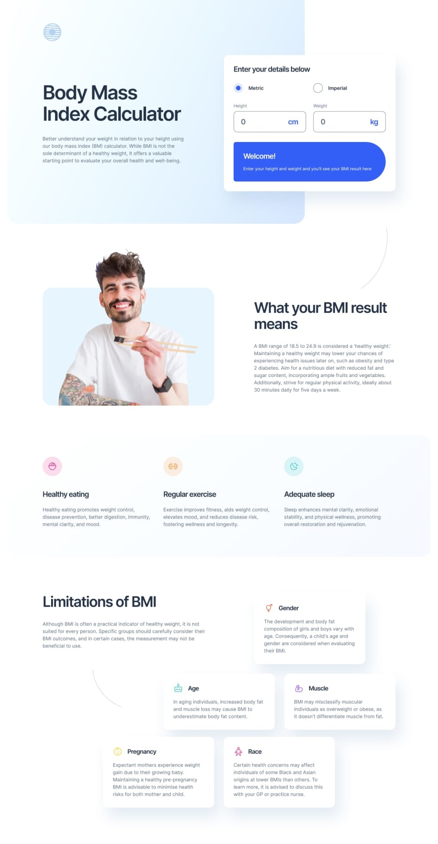
Solution retrospective
What challenges did you encounter, and how did you overcome them?
At first, because of the weird positioning of the background and the calculator, I was going to use absolute positioning on the calculator section. But it got too cumbersome and annoying to manage for each screen size, I ended up making the background absolute instead of the calculator, probably the better way.
The last section looked pretty intimidating. Using a grid with 12 columns may not be the optimal answer, but it worked out... well enough?
Community feedback
Please log in to post a comment
Log in with GitHubJoin our Discord community
Join thousands of Frontend Mentor community members taking the challenges, sharing resources, helping each other, and chatting about all things front-end!
Join our Discord