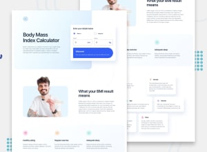
BMI Calculator app with focus on a11y
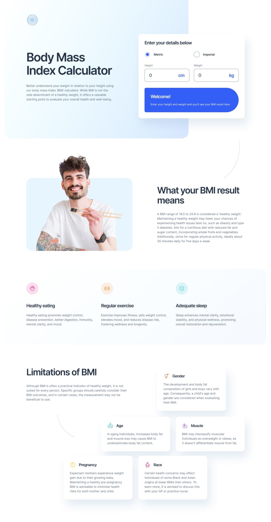
Design comparison
Solution retrospective
- I learned about the css to hide the spin button of input type number in different browsers
- I also learned how to apply different border radius to the div element. This was the result of many hit and trials
- I also learned about how to apply multiple linear gradients to create the background effect like the design
-
Creating the border radius of the result div was challenging. As per design it should be 16px on left corners and 999px on right corners. But when 999px is applied it removes the border radius of left corners. So, it was many hit and trials. And finally found out that 100 to 150 px works for right corners.
-
Also creating the background gradient of the top element was also challenging, finally figured out that we can lay one gradient on top of other to create the effect
- feedbacks are welcome, especially regarding the accessibility
Community feedback
- @35degreesPosted 4 months ago
Great job, and your a11y code is thoughtful and impressive. I will review your forms for your a11y use best practices. Nothing but minor comments, like adding .toFixed() to limit the number of decimal places when you toggle radio buttons. Impressive!
1
Please log in to post a comment
Log in with GitHubJoin our Discord community
Join thousands of Frontend Mentor community members taking the challenges, sharing resources, helping each other, and chatting about all things front-end!
Join our Discord
