Design comparison
Solution retrospective
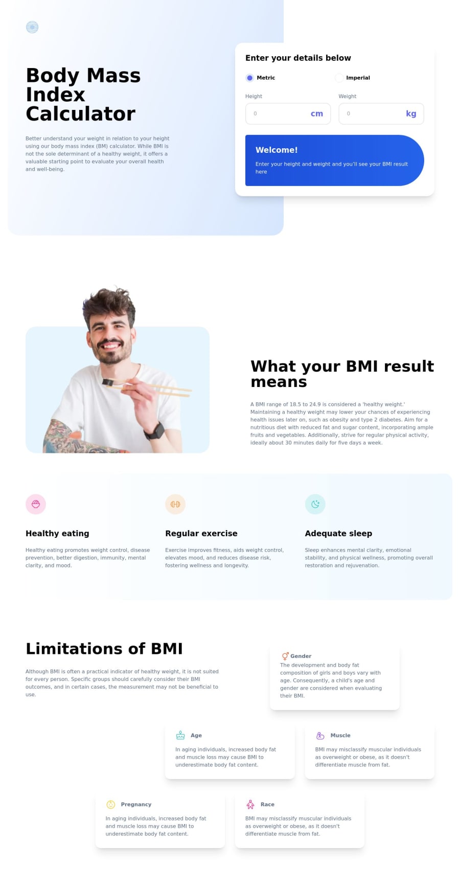
Hello! This is my solution for the bmi calculator challenge! Still working on some parts. It was the first time i've used Tailwind CSS and it is amazing! If You have some suggestion i will really appreciate it!
Have a gooda day!
Community feedback
- @jacksonwhitingPosted over 1 year ago
Nice work with this project. I just finished it as well and used Tailwind CSS. It looks like you're using the CDN to install Tailwind, have you tried using the CLI to build it into your project?
I like how you used body:after for the gradient. I used a grid for the entire hero section and it worked out well, though I had to add "display:contents" for the mobile version in order to get the gradient throughout the hero on mobile and split the gradient and white column on desktop. That was the challenge for me with the layout.
Also - looks like you're still displaying KG in your ideal weight when selecting Imperial so you may want to look at that. Take a look at my code if you'd like.
- Jackson
0
Please log in to post a comment
Log in with GitHubJoin our Discord community
Join thousands of Frontend Mentor community members taking the challenges, sharing resources, helping each other, and chatting about all things front-end!
Join our Discord
