Social Links Profile - w. hover animation

Solution retrospective
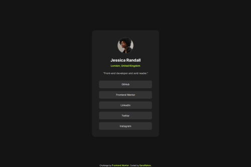
I'm most proud of how close to the original design I was able to get, using only images. I'm also quite proud of the little hover animation I created, and how I feel like I'm getting better and quicker at making these things. I'm definitely experiencing far fewer hiccups along the way, which is encouraging.
I created this using Flexbox and I am feeling fairly comfortable with it by now. However, I have yet to really delve into CSS Grid, and I feel like that is definitely something I need to learn more about, as I understand it is used to style and organise layouts as well.
I would also like to get better at using Figma, as I'm not particularly skilled at using it yet, and I'm sure there are better ways to use it, than how I used it for measuring the design elements (based purely on the pictures provided).
What challenges did you encounter, and how did you overcome them?Initially I'd created the links using s and 's nested inside, but the hover state animation was causing me trouble, as I couldn't get it to change the text color as well. I then troubleshooted the issue and read up on how to work with buttons, where I learned how to style a button better, as well as learning that it's better to not use ``'s at all for external links, as it can be confusing for users of assistive technologies.
I was also struggling with the centering of the component on the live page, but I was able to troubleshoot it with Dev Tools, and found that the lack of vertical centering was due to the main container matching its height to that of the component. Adding height: 100vh; fixed this issue.
Curiously, the links in the attributions footer don't show as clickable in my VS Code preview window, but they work perfectly fine on the live page. I'm not sure why that is, but I haven't looked into it further. I use the Codeswing extension in VS Code, to give me a live preview of my pages as I work on them.
As always, I'd love feedback on my HTML code regarding the structuring and semantics. I'm still very much trying to learn the best way(s) to work with semantic HTML.
Also, if there's anything in my CSS code that stands out to you, as something I could improve or something that seems strange to you, I would love to know!
Please log in to post a comment
Log in with GitHubCommunity feedback
No feedback yet. Be the first to give feedback on SaruMakes's solution.
Join our Discord community
Join thousands of Frontend Mentor community members taking the challenges, sharing resources, helping each other, and chatting about all things front-end!
Join our Discord