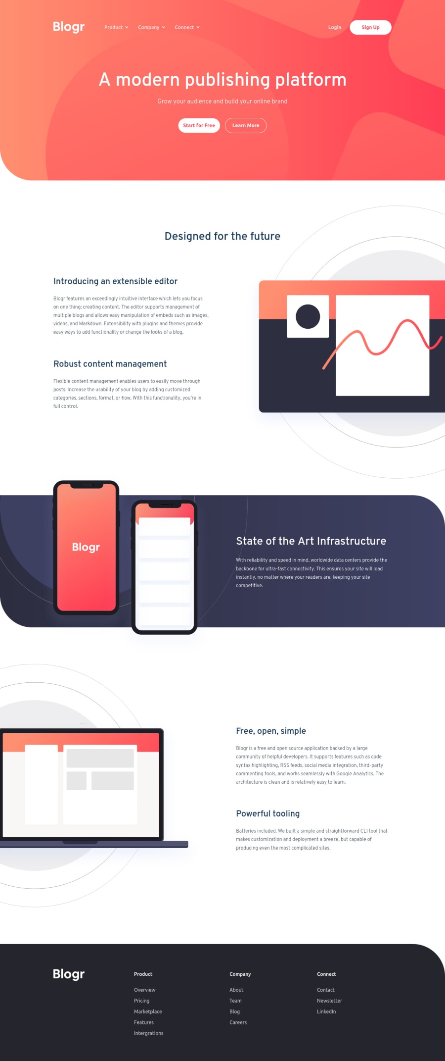
Blorg landing page with html, scss, flexbox and Js
Design comparison
Solution retrospective
Hello guys!
This is an excellent challenge for practicing layout skills. In this job, I tried several forms of screen size for the optimum responsive design! I appreciate any suggestions or advice. Happy coding!
Community feedback
- P@dwhensonPosted over 3 years ago
Hey @koalalikecode lovely job on this one! 🙌 The page looks great and responds nicely to mobile views.
On large views you might want to think about stopping the page from spreading too wide a very large screens. There are many ways to do this but I set a grid on the body element, with three columns, as using a class selector as follows:
.center-content {
	display: grid;
	grid-template-columns: minmax(1rem, 1fr) minmax(375px, 1440px)minmax(1rem, 1fr);
}

.center-content > *  {
	grid-column: 2;
}
The 1440px is the max-width you want the main content to be, and the 1rem values is the smallest spacing you want either side of the main content on small screens (I sometimes put this to 0 and use a container to add padding to each section).
The second part positions all direct children of the body in this nicely sized middle column. In my case, mostly, my header, main, and footer the middle column, and stops them going wider than 1440px. It’s also pretty easy to ‘break’ elements out of this constraint if you need to.
Other people use container classes to do the same thing. This article has a good run down of alternative approaches https://css-tricks.com/the-inside-problem/ You will note I am actually using the approach the author doesn't like!
Either way it's a good idea to find an approach that works for you as you'll need this for a lot of FEM challenges
Some other small points to consider really just relate to your HTML and selection of elements:
• At the minute your dropdown menus are keyboard focusable, this is not idea, I would suggest having a look at this page which give a great approach to dealing with dropdown menus in a progressively enhanced way: https://css-tricks.com/in-praise-of-the-unambiguous-click-menu/
• Similarly, for your burger-menu, to get these working properly, we should be able to open it using the keyboard (which mean the element that opens it should really be a button) and focus should move to the menu and back when it's opened/closed.
This page provides a really in-depth (like REALLY) tutorial on how to build a build a fully-responsive, progressively enhanced burger menu: https://piccalil.li/tutorial/build-a-fully-responsive-progressively-enhanced-burger-menu/
I've used this as a basis for the burger menus that appear in a lot of FEM challenges.
Both these last point might seem like a lot, but I'd really suggest they're worth spending a bit of time on!
But, once again, lovely job on this one!! 👍
Keep it up!
Cheers 👋
Dave
Marked as helpful0
Please log in to post a comment
Log in with GitHubJoin our Discord community
Join thousands of Frontend Mentor community members taking the challenges, sharing resources, helping each other, and chatting about all things front-end!
Join our Discord
